CanFleet
A delivery management SaaS website
Overview
CanFleet is a SaaS platform built for small businesses that run their own delivery fleets and need a way to manage drivers and daily operations more efficiently.
When I joined, the company had recently transitioned from operating a same-day courier service to focusing entirely on its fleet management software. While the rebrand was complete, the website had not yet evolved to reflect the new product direction.
This project focused on updating the website to better support the company’s SaaS offering within a tight three-week timeline.
Role
Visual/Interface Designer
Collaboration
Content writer, front-end devs, marketing manager
Date
July 2023
Timeframe
3 weeks (including development)
Software/Tools
Adobe XD, Adobe Illustrator, Canva
~40%
REDUCTION In Sales Friction
Internal feedback confirmed that the new information architecture effectively eliminated “service vs. software” confusion, allowing the sales team to bypass basic positioning and move directly to feature demos.
~35%
INCREASE In Lead Quality
By implementing transparent pricing and industry-specific landing pages, we successfully filtered out non-B2B inquiries and ensured that incoming leads were more qualified and aligned with our fleet management software.
2X
VISUAL SCALABILITY
Developed a flexible design foundation that enabled the rapid launch of industry-specific verticals, such as the “Cannabis Industry” page, to remain cohesive without requiring a separate design cycle.
Problem
The existing website was still written and structured for end customers of a delivery service rather than business owners evaluating software for managing their own fleets.
Because of this, potential customers struggled to quickly understand what CanFleet offered, who the product was for, and how it fit into their operational workflows. Important information was either unclear or difficult to find, creating friction during evaluation.
This made it harder for the business to clearly communicate value and support confident decision-making at a critical stage of growth.
Goals & Constraints
The goal of the redesign was to help business owners quickly understand the product offering and evaluate whether CanFleet was right for their operations. The website needed to communicate value clearly and guide users through the software in a way that felt straightforward and intentional.
The primary constraint was time. With a three-week timeline from design to launch, the work required strong prioritization, focusing on clarity, messaging, and information hierarchy rather than exhaustive redesign.
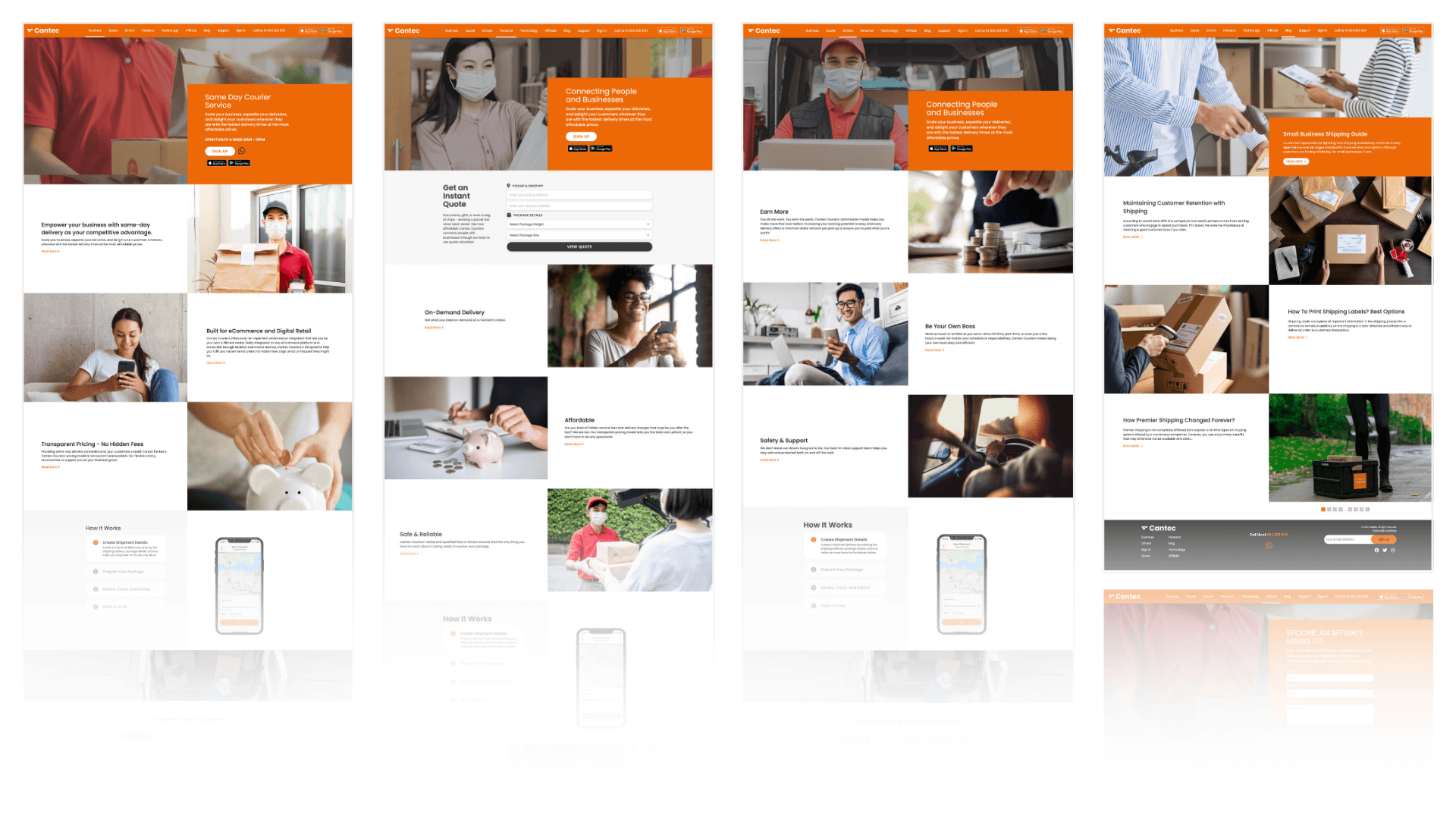
Previous Cantec Courier (now CanFleet) website
Research
Given the tight three-week timeline, research focused on leveraging existing data and aligning closely with cross-functional partners. I collaborated with a content writer and marketing manager to divide responsibilities efficiently. While they focused on content, messaging, and structure, I concentrated on visual direction, layout, and interaction patterns informed by research insights.
Primary Research
Given our time constraints, primary research relied heavily on data collected by the sales team over the past four months during their cold calling efforts.
From this dataset, we focused on understanding:
- What information business owners look for when evaluating delivery management software
- Which features and capabilities matter most during decision-making
- Who the key decision-makers and champions are
- Common needs, concerns, and objections during evaluation
This allowed us to ground website decisions in real customer questions rather than assumptions.
Secondary Research
I conducted a competitor analysis by reviewing comparable fleet management and delivery software websites to understand how similar products positioned themselves.
This research focused on:
-
Common information hierarchy patterns
-
How competitors explained features and pricing
-
Use of visuals, product demos, and social proof
-
Strengths and gaps in how clearly value was communicated
The goal was not to copy competitors, but to identify baseline expectations and opportunities to differentiate through clarity.


Key Findings
Insights from sales conversations were synthesized into an affinity map and grouped by the information potential customers consistently looked for when visiting the website. These findings directly informed messaging priorities and content hierarchy decisions.
The most critical information needs were:
Pricing Transparency
Pricing clarity was a major factor in evaluation. Potential customers wanted to understand cost early, compare options, and avoid surprises later in the buying process.
Feature Clarity
Business owners needed a straightforward understanding of what the software could do and how specific features supported their operational needs.
Product Visibility
Seeing the product helped users better understand functionality and assess fit. Visual representations reduced ambiguity around how the software worked in practice.
Need for Trust Signals
Businesses emphasized the importance of credible signals (reviews, testimonials, case studies) when evaluating software.
Integration Expectations
Customers wanted clarity around how the software integrates with their existing tools to assess fit and implementation effort.
Support
Customers wanted to understand what kind of support was available both before and after purchase, including onboarding and ongoing assistance.
HOW MIGHT WE…
reposition the website to clearly reflect CanFleet’s shift to fleet management software and speak directly to business owners evaluating the product?
Primary Audience
Our primary audience is small business owners and fleet managers responsible for managing delivery drivers, operations, and costs.
These users are typically evaluating software independently and need clear information to determine fit without heavy sales involvement.
User Context
Visitors typically arrive at the website during an evaluation phase, comparing multiple tools and looking for clear answers around pricing, features, integrations, and support.
The site needed to support quick understanding and confident decision-making without requiring a demo.
Goal Alignment
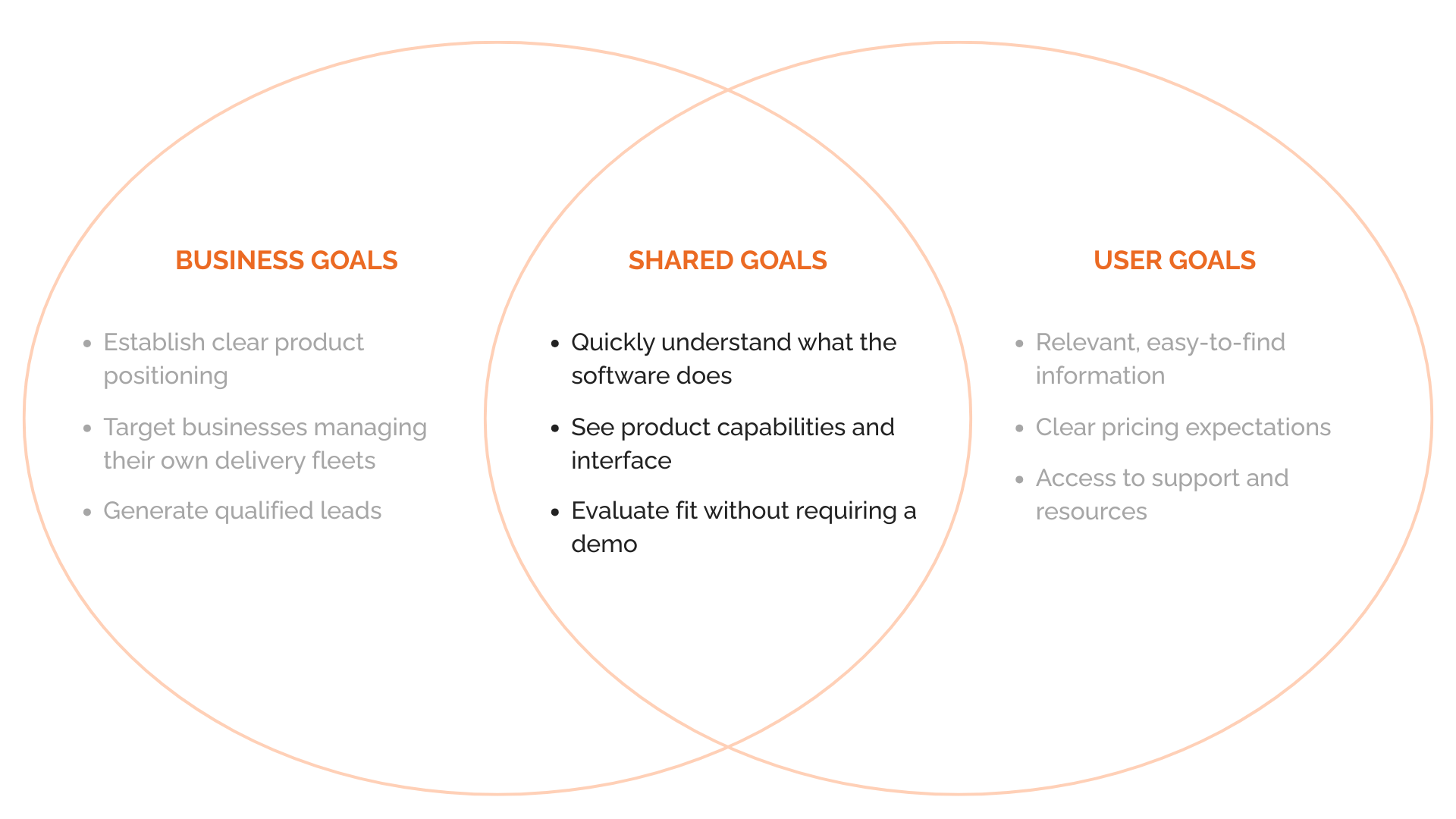
This diagram summarizes how business goals and user needs were aligned to guide prioritization and design decisions.
Prioritization
Given the three-week timeline, not all website updates could be implemented at launch. To stay focused and ship confidently, we prioritized work that directly supported product repositioning and user evaluation, and deferred lower-impact or higher-effort items to a second phase.
Phase 1
Brand repositioning
Update messaging, content, and imagery to clearly reflect CanFleet’s shift to a fleet management SaaS product and speak directly to business owners managing their own delivery operations.
Updated Service Offerings
Remove references to courier services and highlight CanFleet’s software capabilities and benefits, ensuring visitors could quickly understand what the product does and who it’s for.
Educational Resources
Introduce foundational educational content, such as blog articles, to help explain the value of fleet management software and support early-stage learning.
Pricing
Make pricing and plan details easy to find and compare, supporting faster and more confident decision-making during evaluation.
Customer Support
Surface support options clearly through contact information, forms, and FAQs to reduce friction both before and after purchase.
Phase 2 (next)
Integration Capabilities
While integrations were important to customers, they were deferred due to ongoing development work and pending partnerships. We aligned with the product and engineering teams to showcase integrations once they were finalized and ready to present accurately.
Customer Proof
Testimonials and case studies were postponed due to the limited number of long-term B2B customers following the pivot. The customer success team continued gathering testimonials and scheduling interviews to support future case study development.
Live Chat
Live chat was discussed as a potential conversion driver but was deprioritized for launch to maintain focus. It remained a strong candidate for future iteration once core content and positioning were validated.
Sitemap
Based on the Phase 1 priorities, I proposed a streamlined sitemap focused on product clarity, pricing transparency, and lead conversion. The structure was intentionally kept lean to support faster decision-making while avoiding unnecessary complexity at launch.
Key considerations included:
-
Elevating Pricing as a primary navigation item to support evaluation
-
Grouping content around product understanding and education
-
Clearly separating marketing pages from external product flows (sign-in and demo booking)
Wireframe
Once the sitemap was finalized, we worked in parallel due to the tight timeline. While the content writer and marketing manager focused on writing and refining homepage content, I began laying out page structure and preparing visual references from the product itself.
The wireframes focused on content hierarchy and clarity, ensuring that core features, pricing, and product visuals were surfaced early to support faster decision-making. These mid-fidelity wireframes were used to align on structure and flow before moving into high-fidelity design.
Key Design Decisions
01.
Clear Product Positioning
Content hierarchy was redesigned to clearly position CanFleet as a fleet management platform, removing references to courier services and prioritizing messaging for business owners managing their own drivers.
02.
Feature Clarity First
Given the tight timeline, features were presented at a high level with clear descriptions, prioritizing understanding over detailed technical breakdowns.
03.
Pricing Visibility
Pricing was surfaced as a primary navigation item to reduce friction in the evaluation process and support faster decision-making.
04.
Real Product Visuals
Real product screenshots were used throughout the site to provide a clearer understanding of the software and set accurate expectations.
05.
Phased Trust-building
Due to the limited number of customers following the company’s pivot, traditional case studies and testimonials were not included in the initial launch. Instead, clarity of information and product transparency were prioritized, with customer proof planned as a later phase.
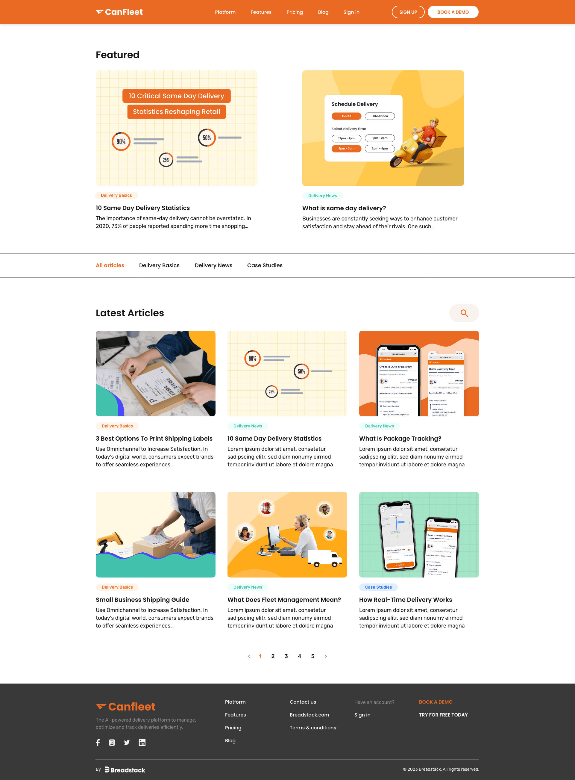
High-Fidelity Design
Homepage
-
Highlights core product value and primary use cases
-
Introduces key features and supported industries
-
Provides educational entry points through blog content
Before
After
Features page
-
Organizes features by role to improve scannability
-
Uses product visuals to support understanding
Industry (Cannabis) page
-
Tailored content addressing industry-specific needs
-
Serves as an entry point for a high-priority customer segment
Pricing page
-
Clearly presents pricing tiers and feature differences
-
Addresses common pricing questions upfront
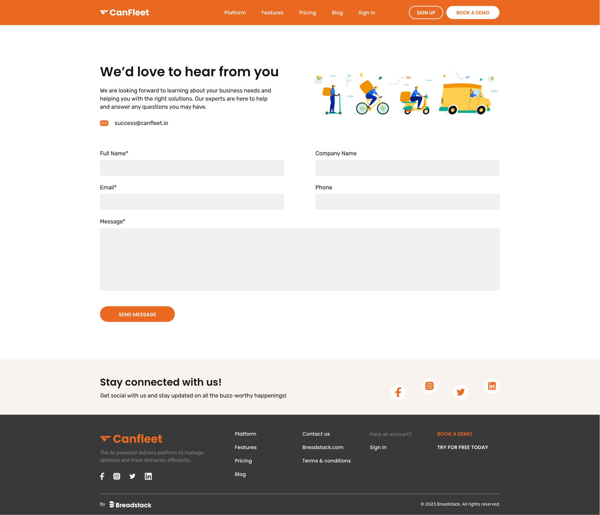
Blog & Contact page
-
Blog supports ongoing education and SEO
-
Contact page is intentionally simple to reduce friction
Summary
While formal external usability testing was not feasible within the three-week sprint, the design underwent rigorous internal validation from marketing, sales, and leadership stakeholders.
Rather than focusing solely on aesthetics, these reviews served as a strategic filter to ensure the new SaaS messaging resolved the primary sales blockers identified in our research. This collaborative feedback loop allowed for rapid, real-time adjustments to content hierarchy and mobile responsiveness, directly resulting in a significant reduction in sales friction and a measurable improvement in lead qualification immediately following launch.
~40%
REDUCTION In Sales Friction
Resolved “service vs. software” confusion, allowing the sales team to skip basic positioning and move directly to feature demos.
~35%
INCREASE In Lead Quality
Leveraged transparent pricing and industry-specific landing pages to filter out non-B2B inquiries and improve lead qualification.
2X
VISUAL SCALABILITY
Built a modular design foundation that enabled the rapid launch of secondary verticals (like Cannabis) without additional design cycles.
Next Steps
Clarify target audience messaging
Refine the homepage positioning to more clearly communicate that CanFleet is designed for business owners and operators, not end customers – especially in the hero section.
Validate and iterate using behavioral insights
Use tools like Hotjar to analyze scroll depth, drop-off points, and engagement with key sections to identify where users hesitated or disengaged, and prioritize updates based on real usage patterns.
Introduce customer proof and integrations
Add testimonials, case studies, and integration details once the product matured and sufficient B2B usage data became available, strengthening credibility during the evaluation stage.
Expand support and educational content
Enhance the support experience with clearer FAQs, documentation, and broader educational content to help prospective customers better understand how the product fits into their operations.
Takeaways

Early alignment shapes everything downstream
Getting product, marketing, and sales aligned upfront made it possible to move quickly, make tradeoffs with confidence, and avoid rework under a tight timeline.
Clear positioning matters more than completeness
In a product pivot, helping users quickly understand what the product is and who it’s for had more impact than trying to explain every feature.
Sales-facing clarity is critical during a pivot
The website became a practical sales tool, not just a marketing asset, reinforcing how closely product storytelling needs to support real sales conversations.
Research doesn’t have to be perfect to be useful
Even without formal usability testing, sales insights and directional traffic patterns were enough to inform priorities and make confident design decisions.