Overview
Chatso is an AI-powered live chat tool built specifically for eCommerce, designed to help businesses better understand customer intent and turn conversations into sales. Launched in fall 2023, Chatso was introduced as a standalone product to evaluate whether it could gain traction independently from the Breadstack platform.
This campaign was created to validate early market interest and product awareness rather than optimize for immediate lead volume. As an early-stage product, the goal was to test how different value propositions, visuals, and messaging resonated with eCommerce merchants and to gather directional insights for future positioning.
Working closely with the content writer, social media manager, and marketing lead, I received multiple copy variations for both ad creatives and the landing page. I began the project with a competitive analysis, reviewing similar tools in the market to:
-
Assess visual styles and layout patterns
-
Identify common messaging approaches within the category
-
Evaluate competitors’ strengths and gaps in positioning
Using these insights, I explored a range of creative directions and design variations to support experimentation and learning.
Deliverables:
-
Ad creatives for LinkedIn, Facebook, and Google, with multiple variations for testing
-
One landing page template designed to support campaign messaging and signups
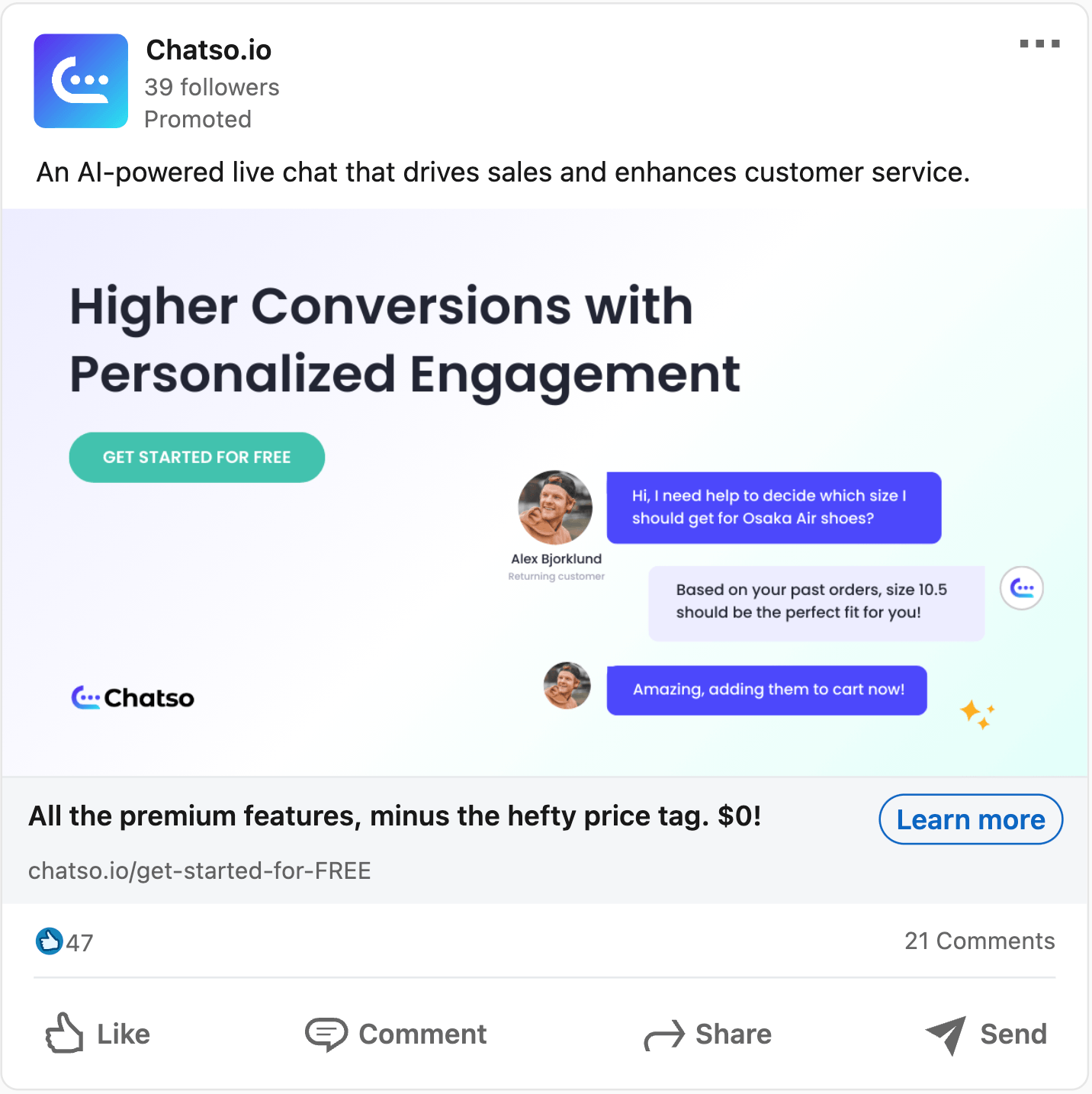
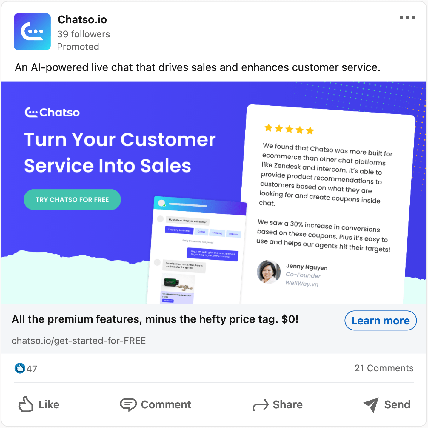
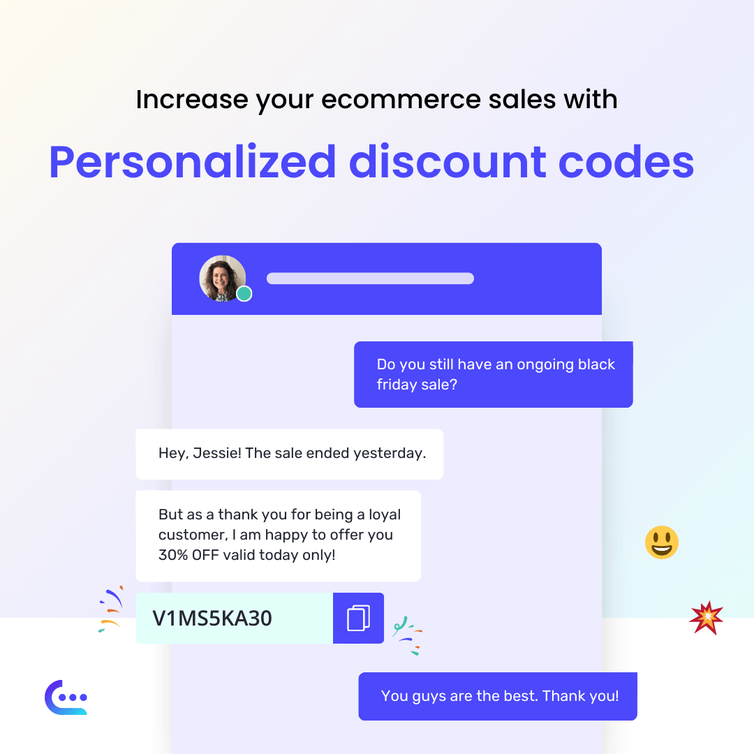
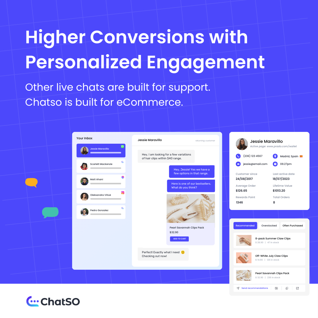
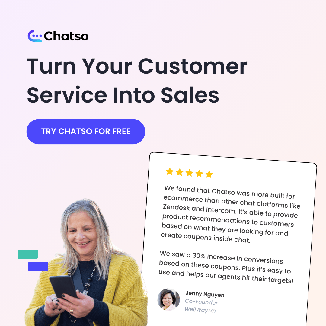
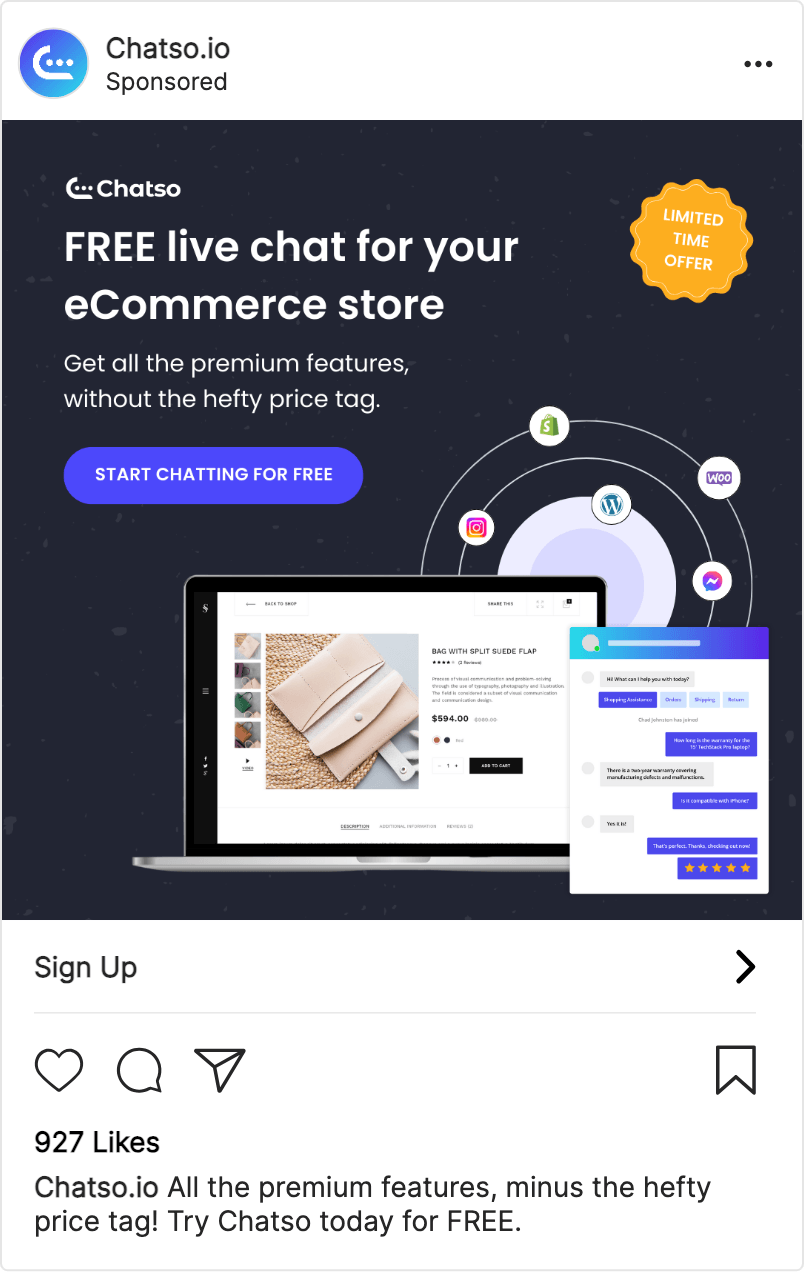
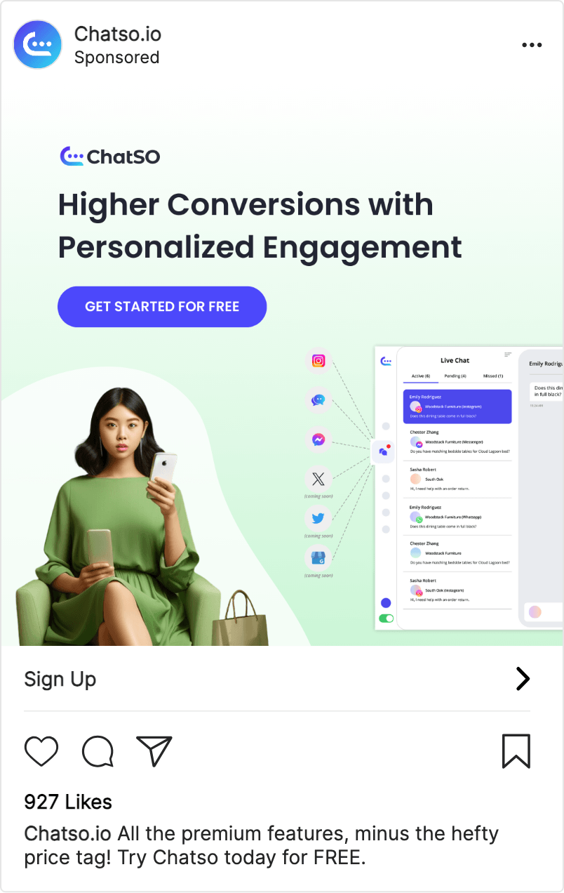
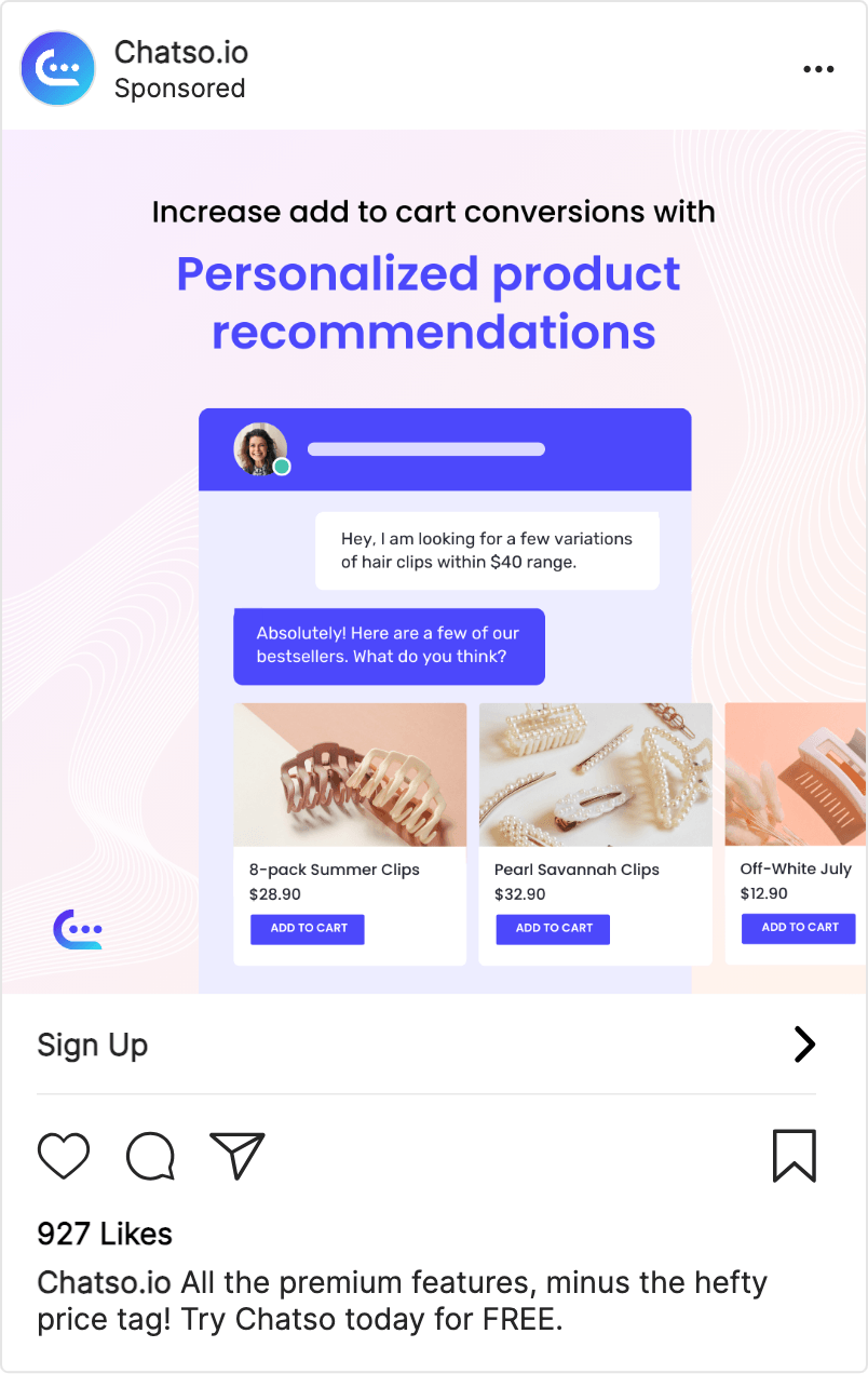
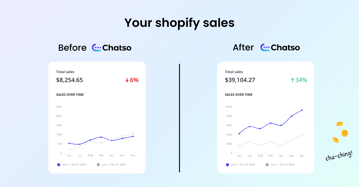
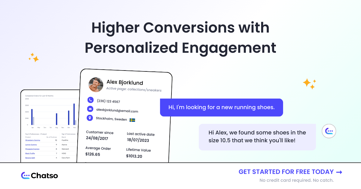
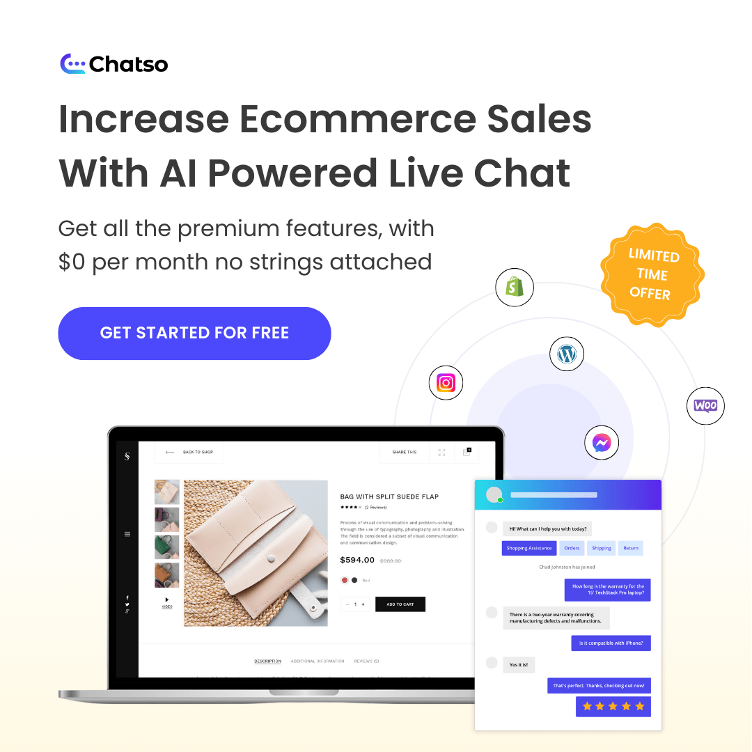
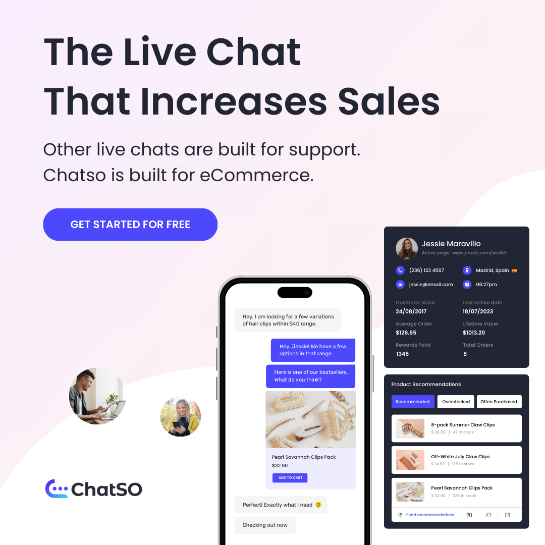
01. Ad Creatives
This campaign involved extensive creative exploration, with a high number of variations produced across platforms. As an early-stage product still defining its positioning, the objective was to test a wide range of messaging and visual approaches rather than converge quickly on a single direction.
Management encouraged broad experimentation to explore what might resonate with eCommerce audiences. In response, the marketing team executed multiple creative directions in parallel, testing variations in:
-
Messaging focus (conversions, personalization, customer support, free access)
-
Visual hierarchy and layout
-
UI-forward versus lifestyle-led compositions
-
Call-to-action prominence and phrasing
While the volume of variations introduced complexity during execution, it provided valuable clarity on which themes and structures performed more effectively and which added noise without improving results.
The examples below represent a snapshot of the range of creatives developed and tested during the campaign, reflecting both the exploratory nature of the project and the learning-driven approach taken at this stage.

02. Landing page
I designed a single evergreen landing page to support multiple ad variations during the campaign. While ad copy explored different angles and hooks, the landing page maintained a consistent core message to introduce Chatso’s value clearly and avoid fragmenting the experience.
Working closely with the content writer, we focused the hero section on a high-level value proposition that could support multiple entry points from paid ads. This approach allowed the team to test a range of ad messages while keeping the landing experience stable and easy to understand.
Future iterations were planned to explore tighter ad-to-landing message alignment once early performance signals were validated.
03. Results
The paid campaign ran for approximately three weeks and was evaluated against internal campaign goals rather than long-term historical benchmarks, as Chatso was a newly launched product.
During this period:
-
Signups exceeded the internal campaign goal by 18%, indicating early interest in the product and offer
-
The campaign helped validate initial market curiosity around Chatso as a standalone product, rather than driving large-scale lead volume
Because the campaign was exploratory in nature, results were used primarily to assess demand signals and inform future positioning rather than optimize for scale.
04. Key Learnings
- The “free” offer was a strong attention driver
Ads that clearly communicated free access attracted more engagement, reinforcing the importance of a low-friction entry point for a new product. - Visible CTAs helped guide interaction
Ads that included a clear call-to-action button (e.g. “Start for free”) received slightly higher engagement than those without a visible CTA, suggesting that explicit prompts helped reduce hesitation during early exploration. - Testing too many variations reduced clarity
Running a high number of creative variations made it harder to isolate which messages were meaningfully improving performance, highlighting the need for more focused testing in future campaigns. - Early interest existed, but positioning required refinement
While signups exceeded expectations, results indicated users were still in an early exploration phase, pointing to opportunities to sharpen value messaging and use cases.