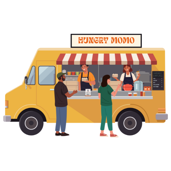
Hungry Momo
An ordering app for a Thai food truck
Overview
Hungry Momo, a Thai food truck based in Vancouver, serves up delicious Thai dishes to busy customers. But here’s the challenge: during lunch rushes, the lines get seriously long. And let’s face it, no one likes waiting around when hunger strikes.
To tackle this, Hungry Momo decided to launch an app that lets customers skip the line and order straight from their phones. The goal is to make ordering as quick and painless as grabbing the food itself – just order, pay, and pick up when it’s ready.
My role was to identify the key pain points, research customer needs and expectations, and design a simple, user-friendly app that solves the problem.
Role
UX Designer
Date
Nov 2023 – Jan 2024
Timeframe
8 weeks – 80 hours
Software/Tools
Figma, Illustrator, Photoshop
Problem
Hungry Momo’s popularity often leads to long lunch lines, causing some customers to turn to other nearby options. For busy professionals with limited lunch breaks, waiting in line isn’t practical, resulting in lost opportunities for the business.
Objective
Instead of seeing it as an issue, Hungry Momo sees this as a potential to invest in an application as well as necessary resources that will allow customers to easily browse the menu, place orders, pay online, and track their order status with notifications for pickup. This eliminates the need to wait in line and ensures a smoother, more convenient process for everyone.
How might we design an app that makes ordering from food trucks faster and easier, reducing long wait times?
Research
I used a combination of secondary and primary research methods, starting with market research and competitive analysis, followed by interviews and Reddit discussions. My focus was on potential app users—current and future food truck customers—rather than food truck owners.
This approach helped me understand general customers pain points when buying from food truck, as well as expectations and limitations on the upcoming app. Here is my complete research plan.
Secondary Research
I began my research with a broad market analysis of the food truck industry, looking into locations, cuisines, operating hours, and ordering processes. From there, I focused on customer pain points using insights from Google reviews, food truck event feedback, social media comments, and Reddit discussions. This helped me identify key assumptions and questions for validation in my primary research.
I followed up by conducting competitive research on other food truck businesses, analyzing their best practices, app experiences, key features, visual design, and content structure to gather insights and inspiration.
Here is my competitive audit table as well as my competitive audit report.
Primary Research
I conducted interviews with five participants who represent the ideal users of the app. These included working professionals and students over 18, each with significant experience ordering from food trucks (at least 10 times). Additionally, I posted on the Food Truck subreddit to gather insights from the broader community about their experiences and opinions on the concept of an ordering and payment app.
User Interviews

Male, 23
Film Visual Effect Student

Male, 30
Identity & Access Analyst

Female, 28
Digital Marketing Specialist

Female, 42
Product Manager

Male, 25
Photographer/Videographer
View my interview notes.
Reddit Post
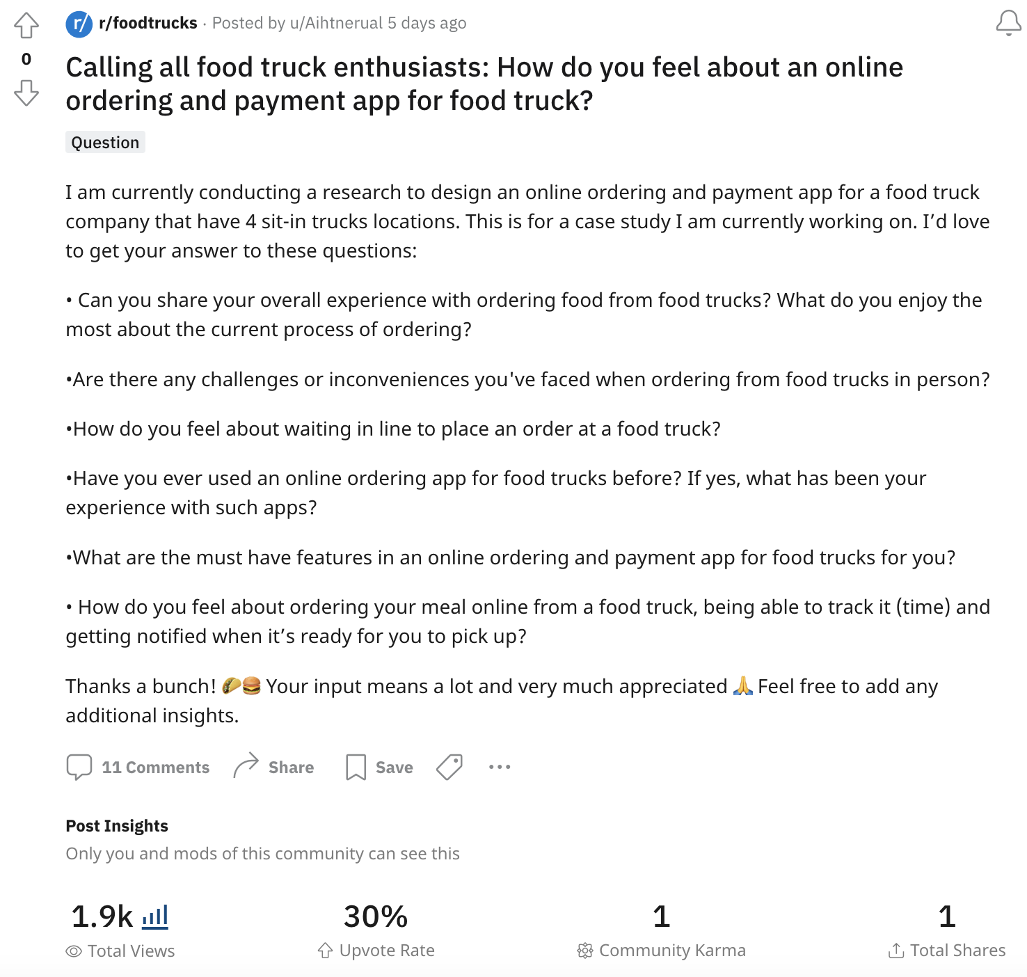
Key Findings
I organized the data I gathered from the interviews and online reviews/comments into affinity maps, grouping it by the pain points that they experience when ordering from food trucks and their expectations of what the app can do for them to make ordering easier.
Below is the summary of the key findings on the top 3 pain points and top 5 app features expectations.
View the pain points affinity diagram and the expectations affinity diagram.
What are customers PAIN POINTS?
Line up & wait time
The primary issue the app aims to solve.
The long line up on food trucks is one factor that drive people away. Many who are getting meals from food trucks are on their lunch break and they do not have the luxury of time to be in a long line up. Furthermore, most food truck does not have seats or any designated waiting area, which can be inconvinient especially if you are at a mercy of the weather.
“Long line up, no dine-in area. Not a fan of waiting in line, that’s all.”
Menu availability
An issue the app aims to solve.
Many food trucks have their menu printed and displayed on the side of the truck. Customers find it difficult to look at the menu when the line up is too long and some items might not be available or sold out, but they can only find this out once they are at the cashier putting their order in.
“It’d be nice if they have an electronic menu cause sometimes they have a paper printed menu on the side of the truck and it’s hard to see, especially when the lines are really long.”
Pricing & food quality
An issue the app could partially solve.
Visual representations provide users with a clearer understanding of the software’s interface, functionality, and features. Seeing the product in action helps users visualize how it can address their specific needs and challenges.
Review from google – “Waited over 50 mins for $14 tacos that had about $3 worth of filler inside.”
What are customers EXPECTATIONS?
These insights shaped every part of my design decisions. I used these as core requirements to guide the structure, features, and user experience of the final design.
Order and pay
First and foremost, allow customers to seamlessly place an order and pay through the app.
Real-time menu
Have a complete menu that reflects all current promotions and all items that are no longer available or sold out for the day.
Order tracker
Have an order tracking system that is highly accurate and reliable.
Location accuracy
Show the current location of the food truck.
Preference request
Allow customers to put a note for any dietary requirements (in case of allergies, halal request, preferences).
Customer service
Allow customers to reach out to the food truck directly through the app in case of any issues.
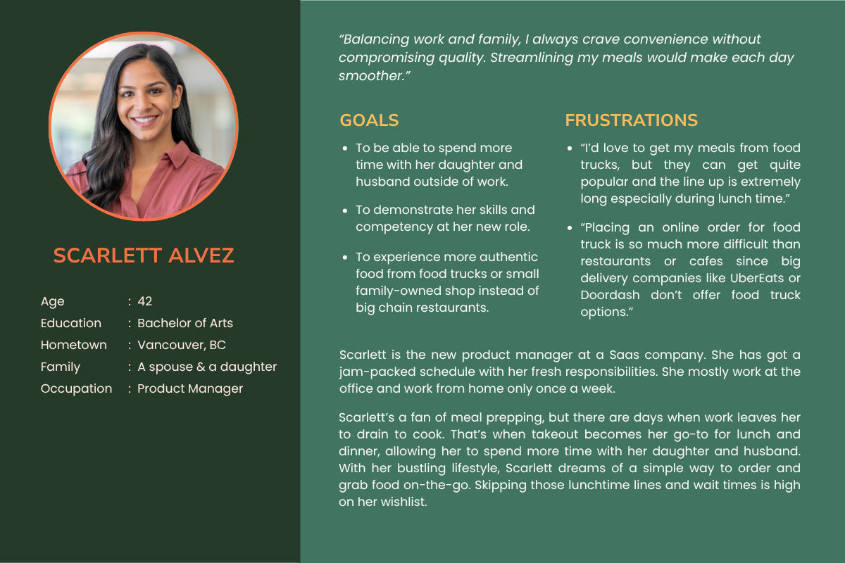
Personas
+ Empathy Maps
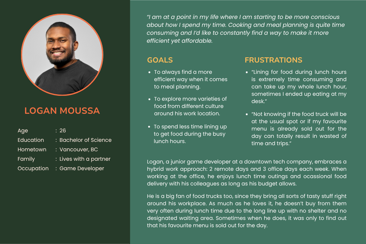
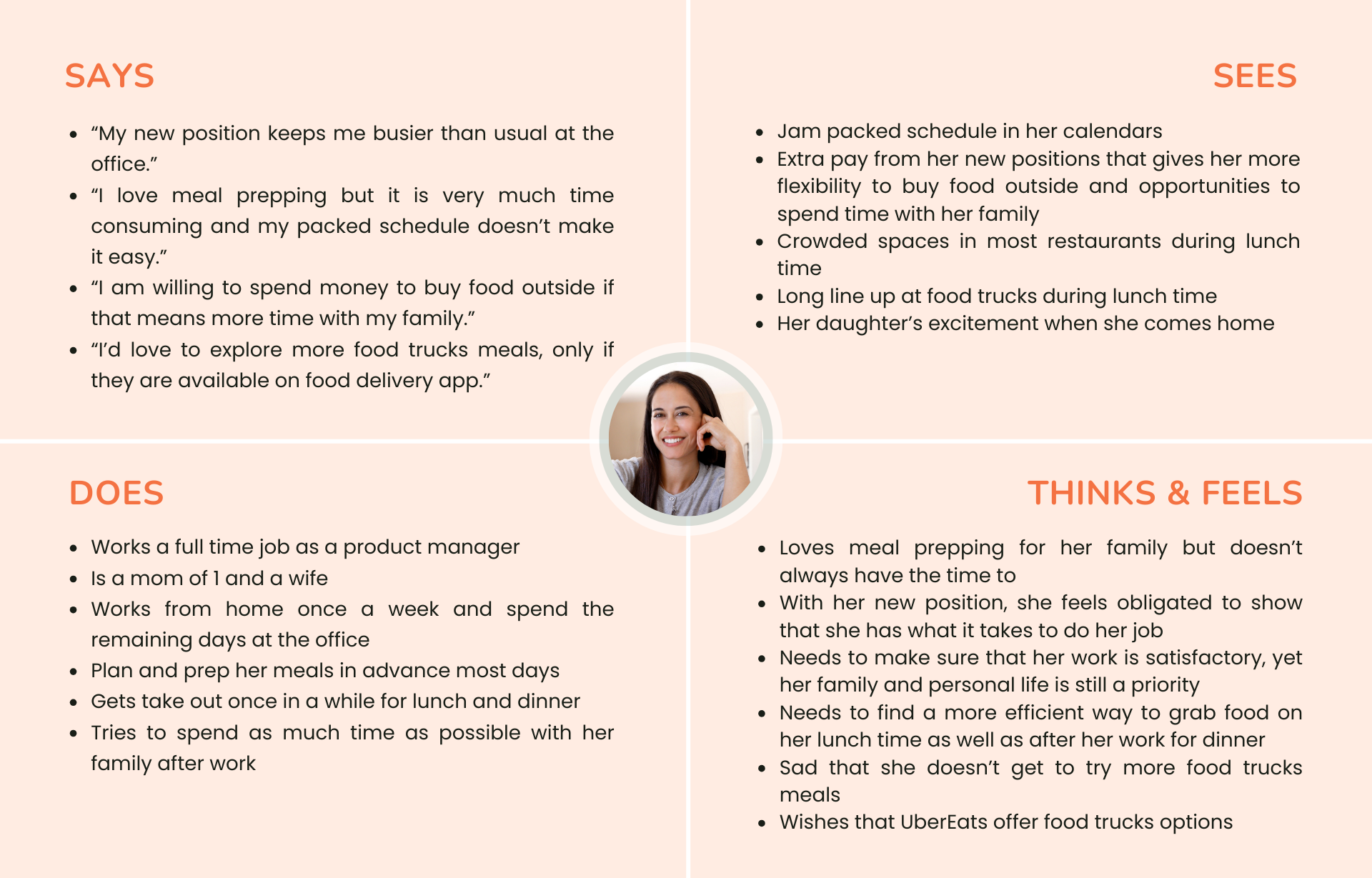
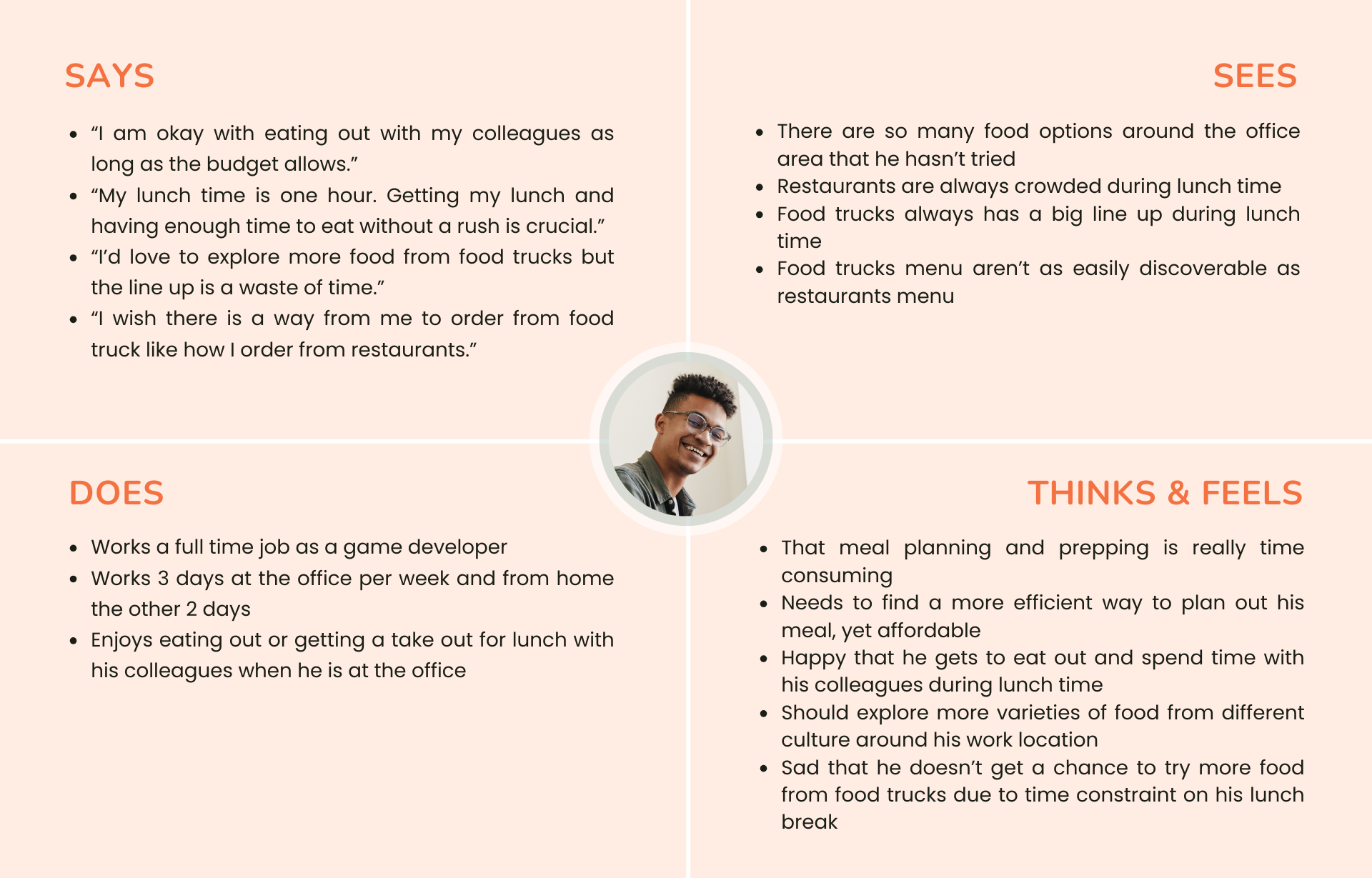
Meet Scarlett and Logan.
With a deeper understanding of the customers’ needs, preferences, and pain points, I created two personas profiles with different scenarios yet similar goals.
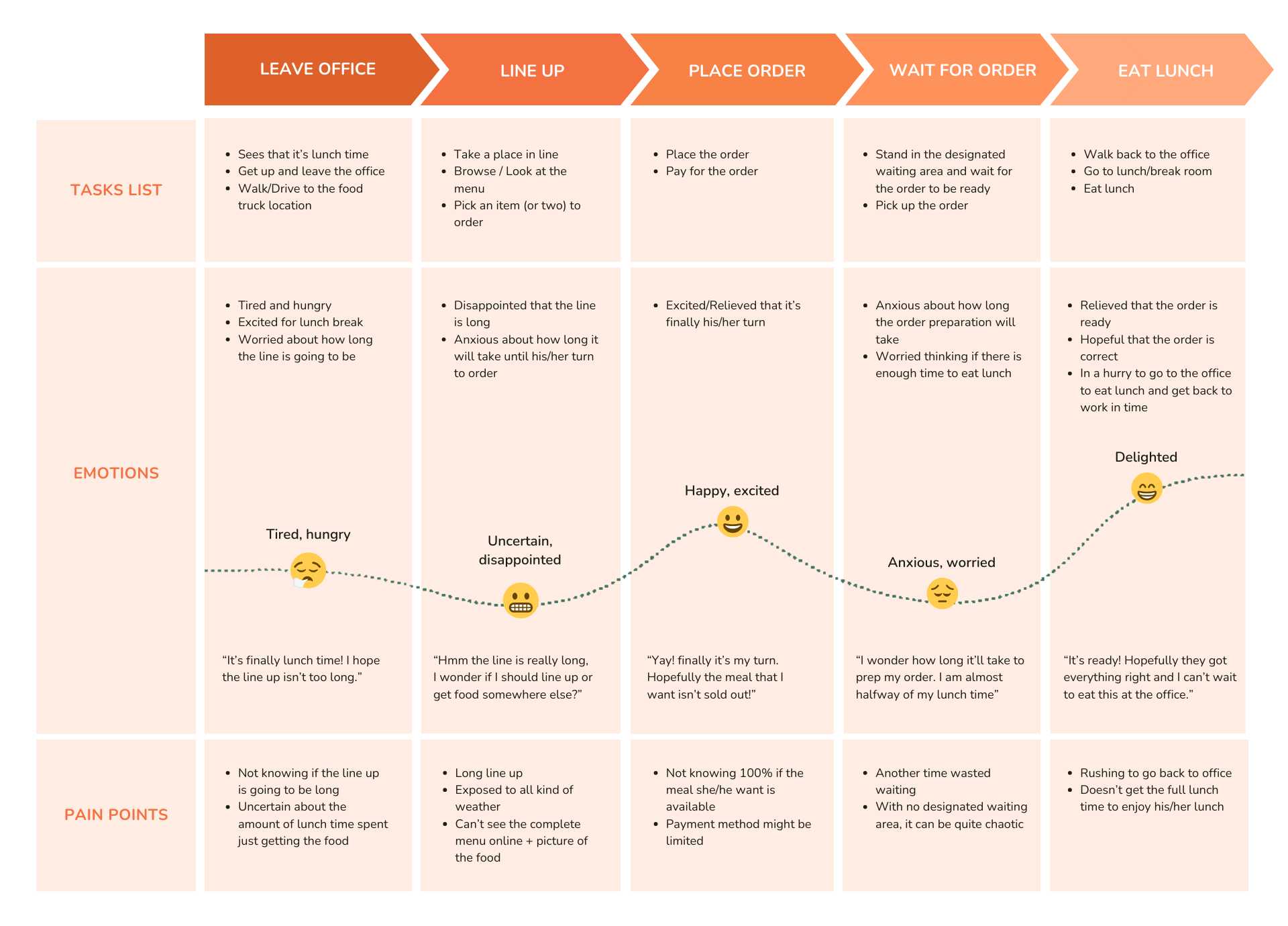
User Journey Map
With both of my personas in mind, I created a journey map to visualize the experience of the customer when buying a meal from a food truck. This allows me to comprehend customers’ thoughts, emotions, pain points and their choice of actions at each moment in this buying journey, and then figure out how to best improve their experience.
How Might We
From this journey, I developed several How Might We statements, each addressing a specific challenge within different parts of the user journey. These statements guided my problem-solving approach, helping me explore potential solutions for improving the ordering process.
Eventually, they all led to one main How Might We statement that focuses on streamlining the experience and reducing wait times.
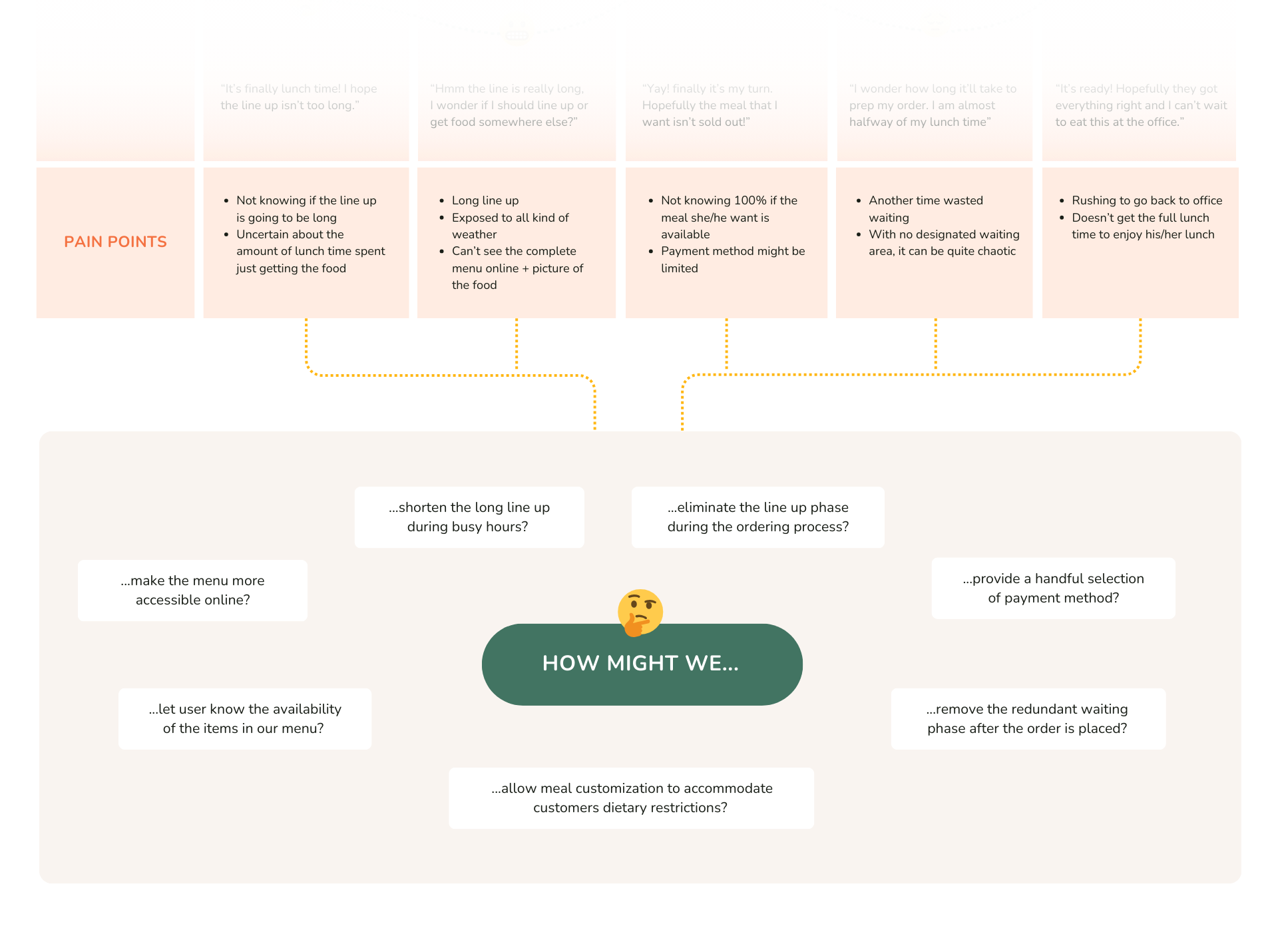
How might we design an app that makes ordering from food trucks faster and easier, reducing long wait times?
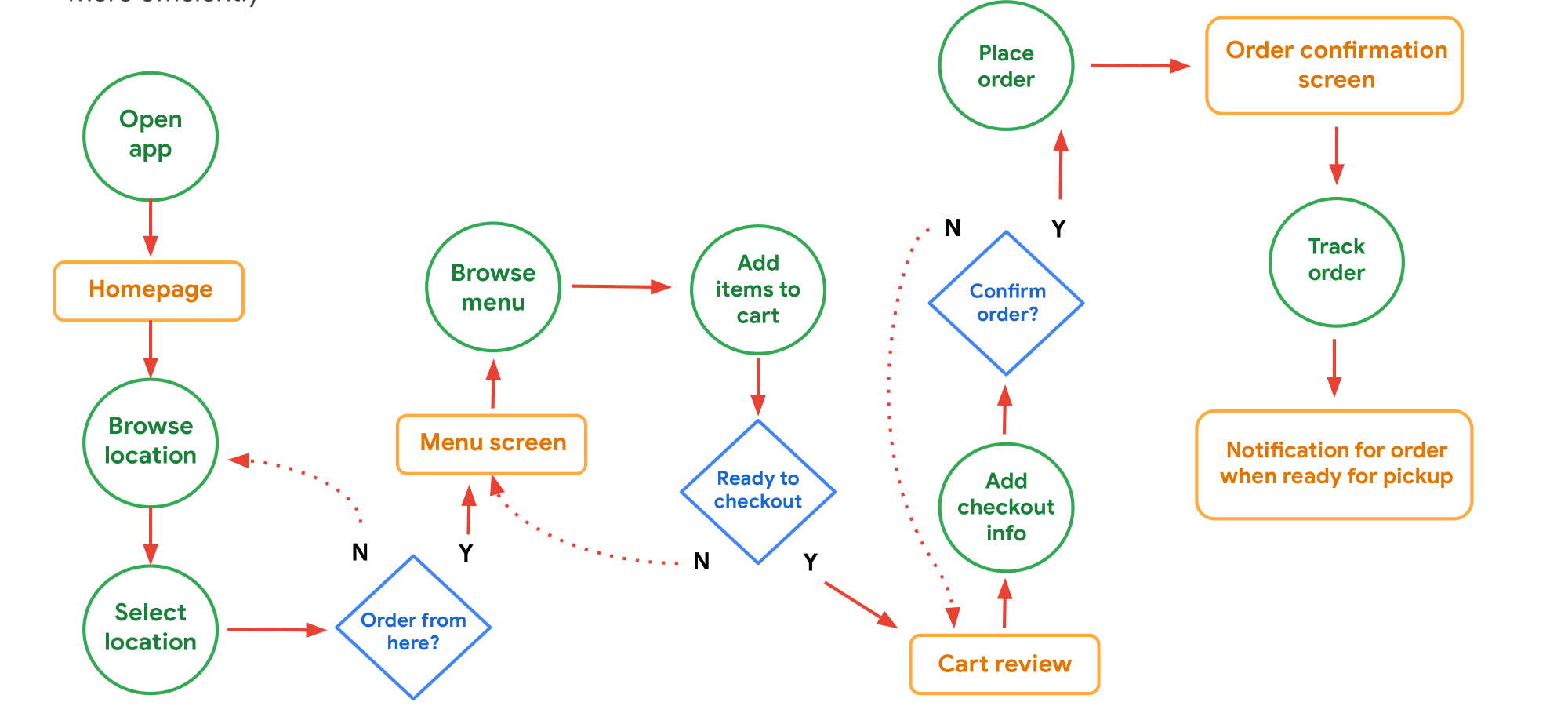
User Flow
I mapped out a user flow that outlines the key steps a customer takes to order and pick up their meal. This helps identify potential friction points and optimize the process for efficiency.
User Task: Browse Hungry Momo’s menu based on preferred location and place an order.
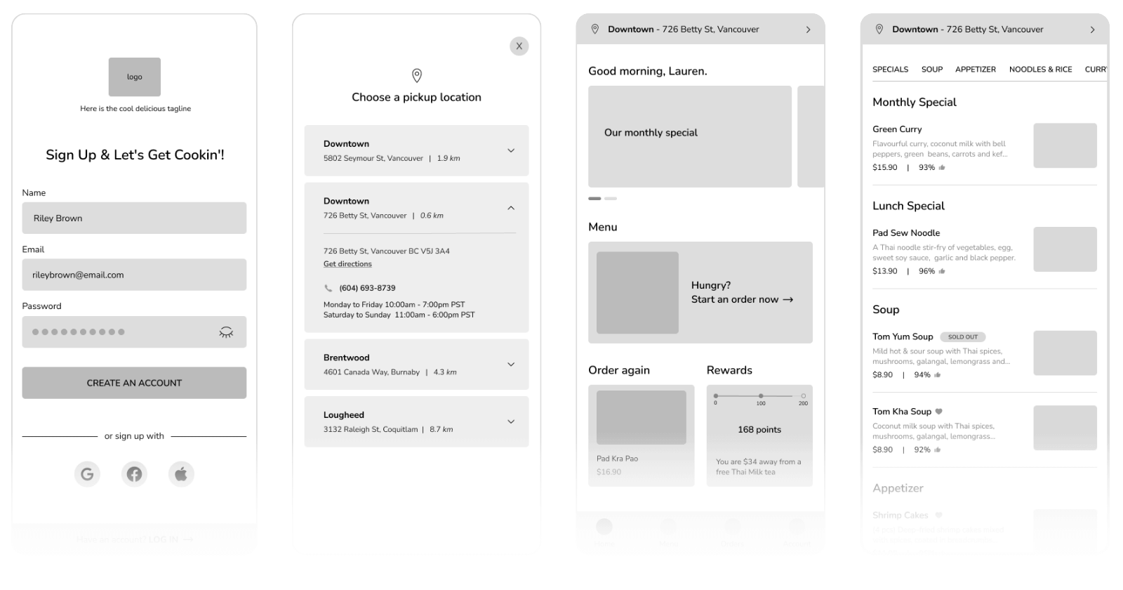
Wireframe
Using my User Flow as reference, I first sketched rough wireframes on paper before refining them digitally in Figma.
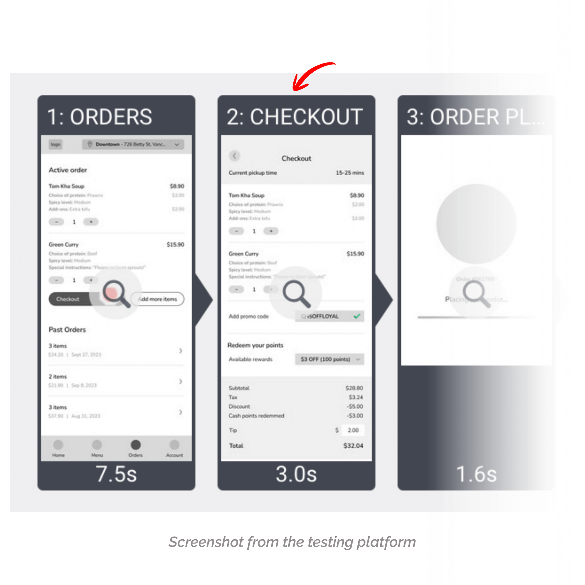
User Testing
To validate the new feature, I conducted remote moderated usability testing with 8 participants who fit the target user profile. Each participant interacted with a clickable Figma prototype and was guided through five realistic tasks, followed by a short set of rating-scale questions.
The primary goals of this test were to answer:
-
How long does it take users to locate the pickup location settings?
-
What patterns emerge in how users browse the menu and add items to the cart?
-
How easily can users move through the checkout process—from cart to payment to placing an order and tracking it?
-
Are there essential features users expect when ordering food online that the app currently lacks?
Task 1 - Sign up for an account
This opening task assesses how straightforward the sign-up process is for new users. Participants are asked to create an account from scratch.
Task 2 – Set the pickup location
This task evaluates how easily participants can select or change their pickup location, given that multiple food truck locations are available.
Task 3 – Add an item to the cart
Participants are instructed to browse the menu and add Tom Kha Soup to their cart. This task helps measure how smoothly users can navigate the menu and initiate an order.
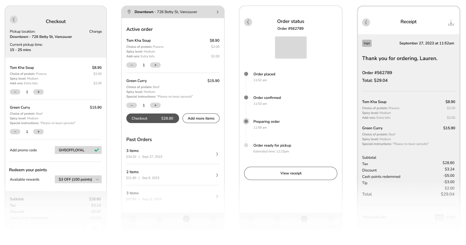
Task 4 – Checkout and place the order
After adding the item to their cart, participants proceed through the checkout process – reviewing their order, selecting a payment method, placing the order, and confirming it for pickup.
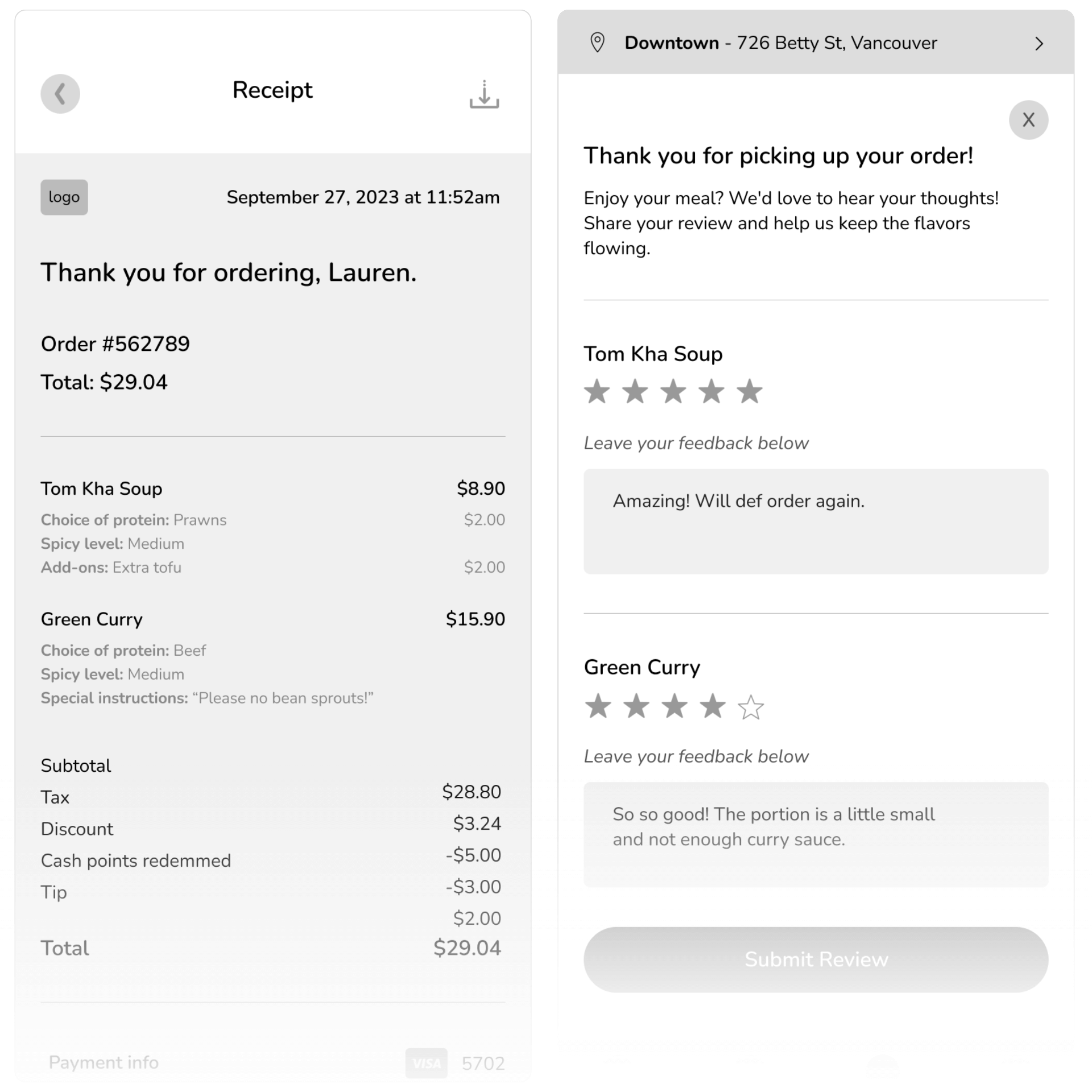
Task 5 – Leave a review & download the receipt
Once the order has been picked up, participants are asked to leave a rating and brief review, then download their receipt. This task tests the clarity and accessibility of post-purchase features.
After completing the tasks, I asked participants five rating-scale questions to better understand their overall experience. These questions covered aspects such as their overall satisfaction with the app, likelihood of using it again, and willingness to recommend it to others.
View my full user testing report and affinity diagram for a deeper breakdown of findings.
Revisions
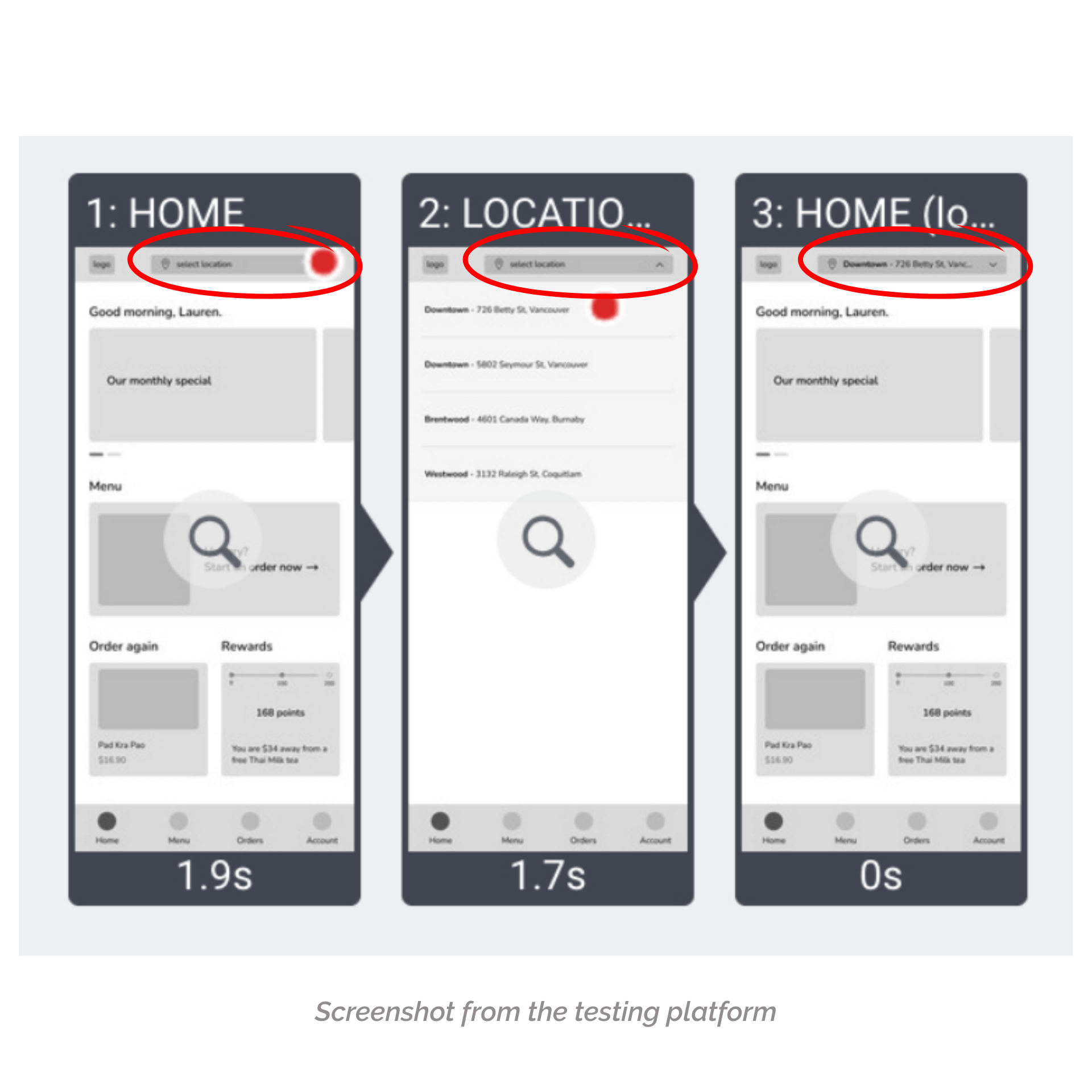
Finding #1
Most participants prefers to have a easier and more straight forward steps to set their pick up location
- 3 out of 8 participants successfully setup their pickup location
- 4 out of 8 participants successfully setup their pickup location but they were having difficulties finding the drop down
- 1 out of 8 participants missed the location drop down entirely and didn’t complete this task
“Rated 10. The location button was very small for the mobile, so it just took a few minutes to find/see where it was on the screen.” – Participants No.4
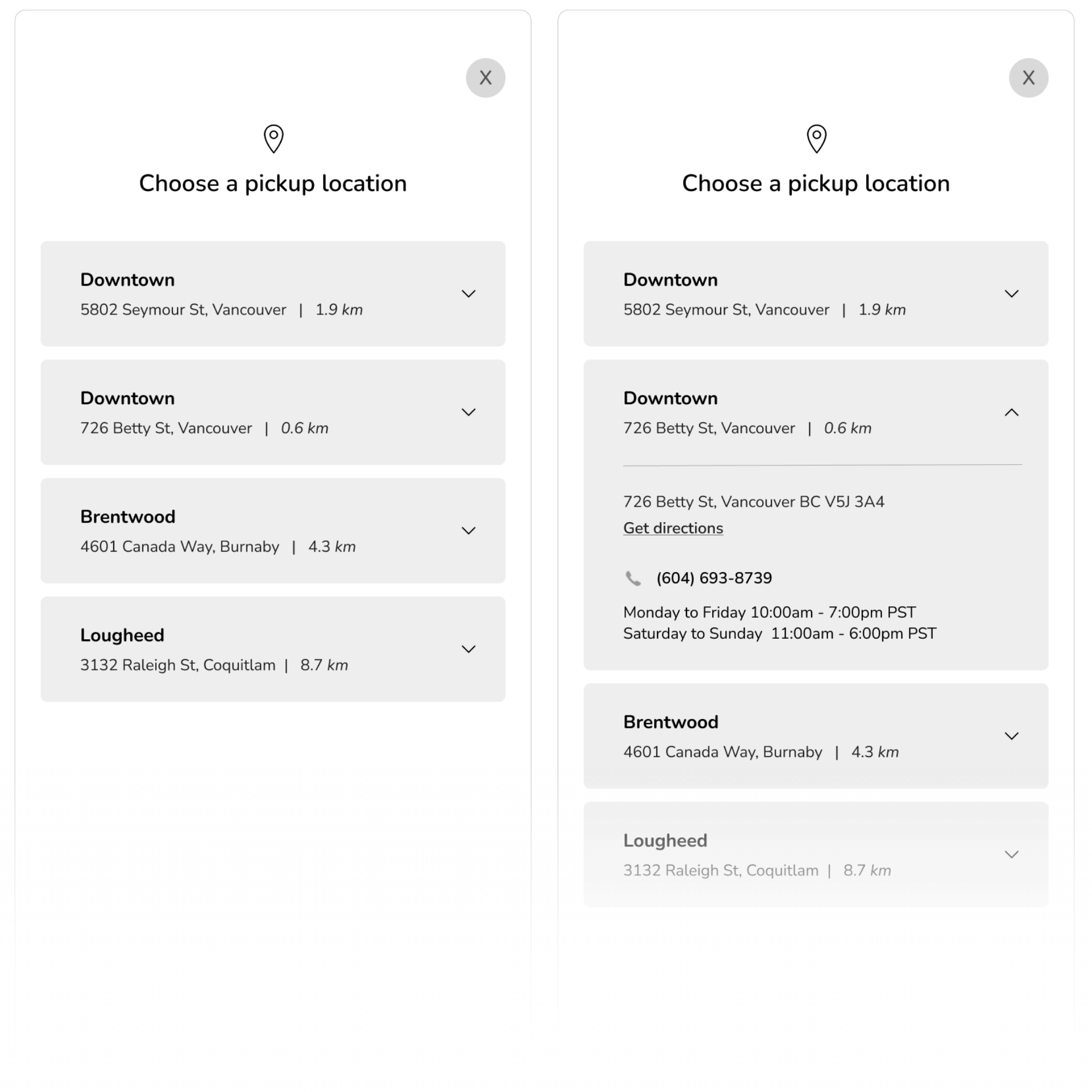
Implementation
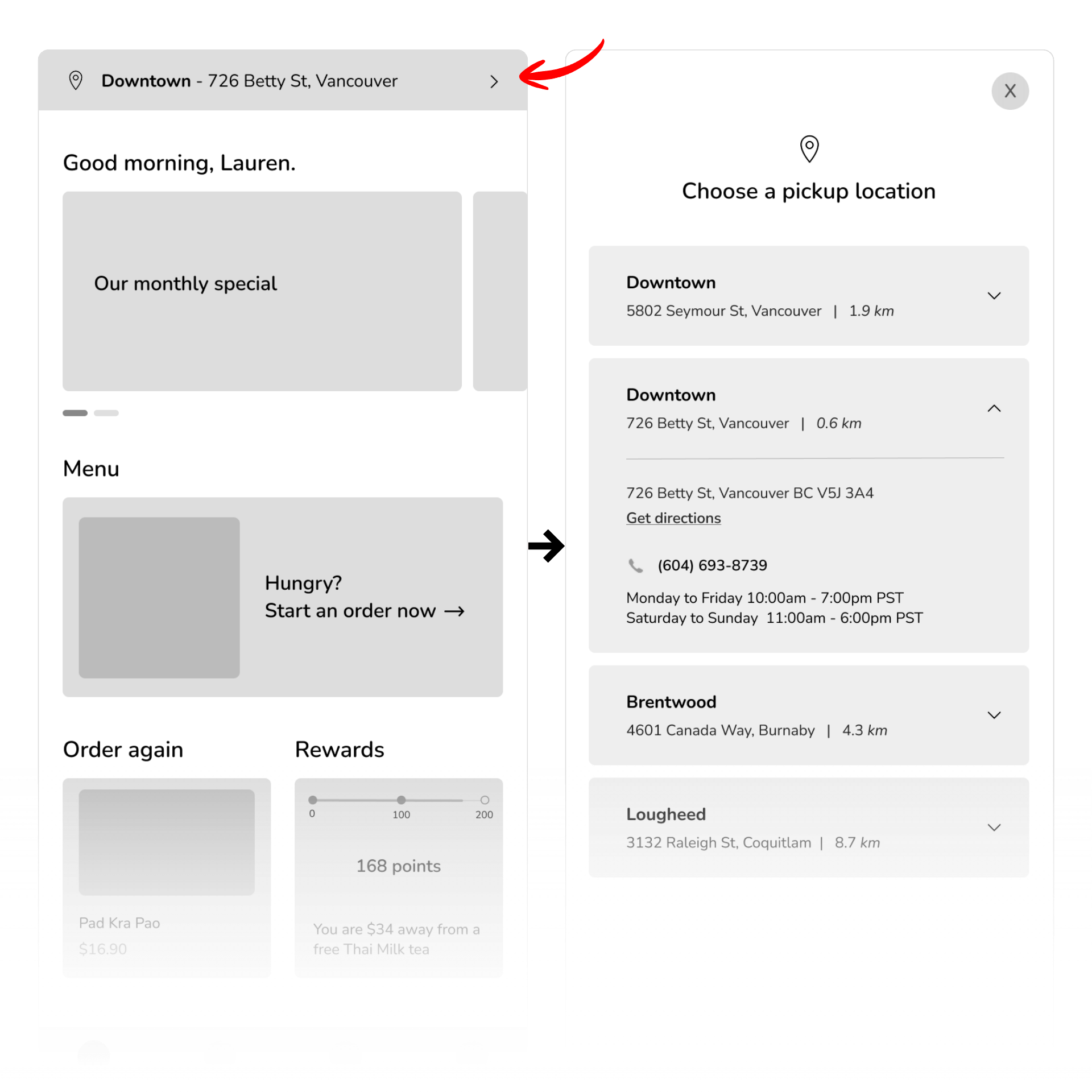
I kept the pickup location dropdown at the top of the screen but redesigned it to make it more noticeable. I removed the main logo to free up space, expanded the dropdown to full width, and added a default location format showing both the name and address (e.g., “Brentwood – 4601 Canada Way, Burnaby”) so users can see the full details without tapping.
BEFORE
AFTER
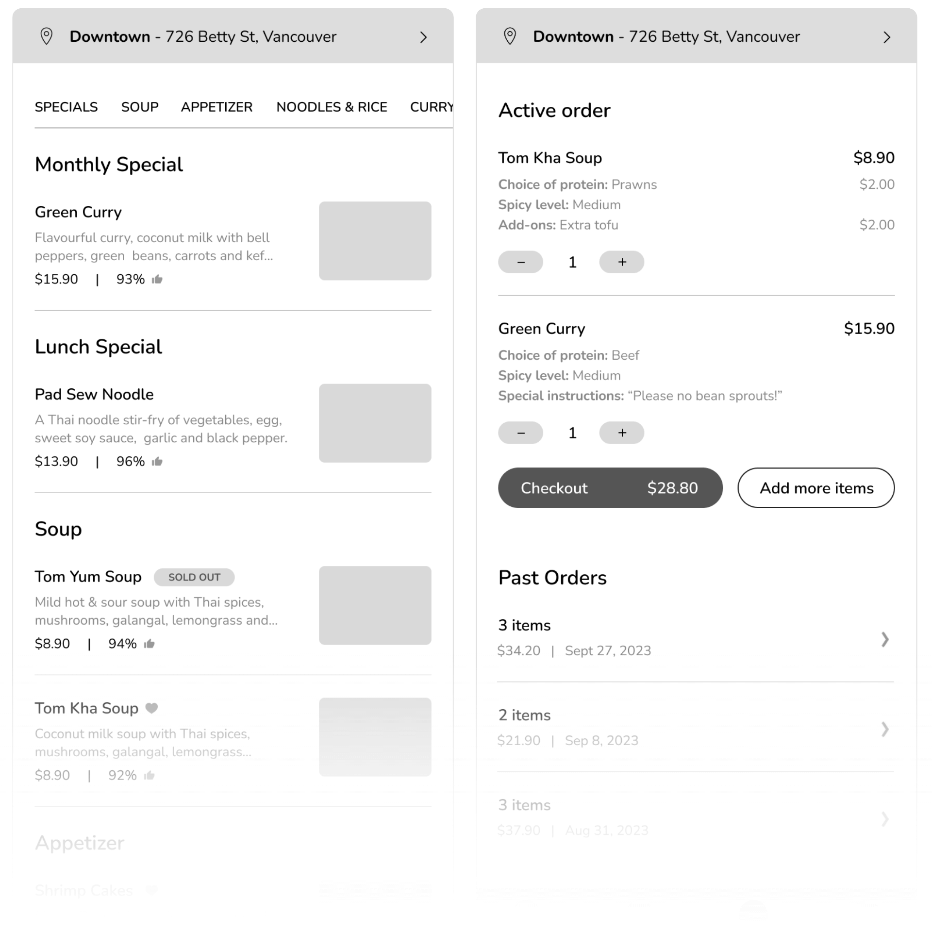
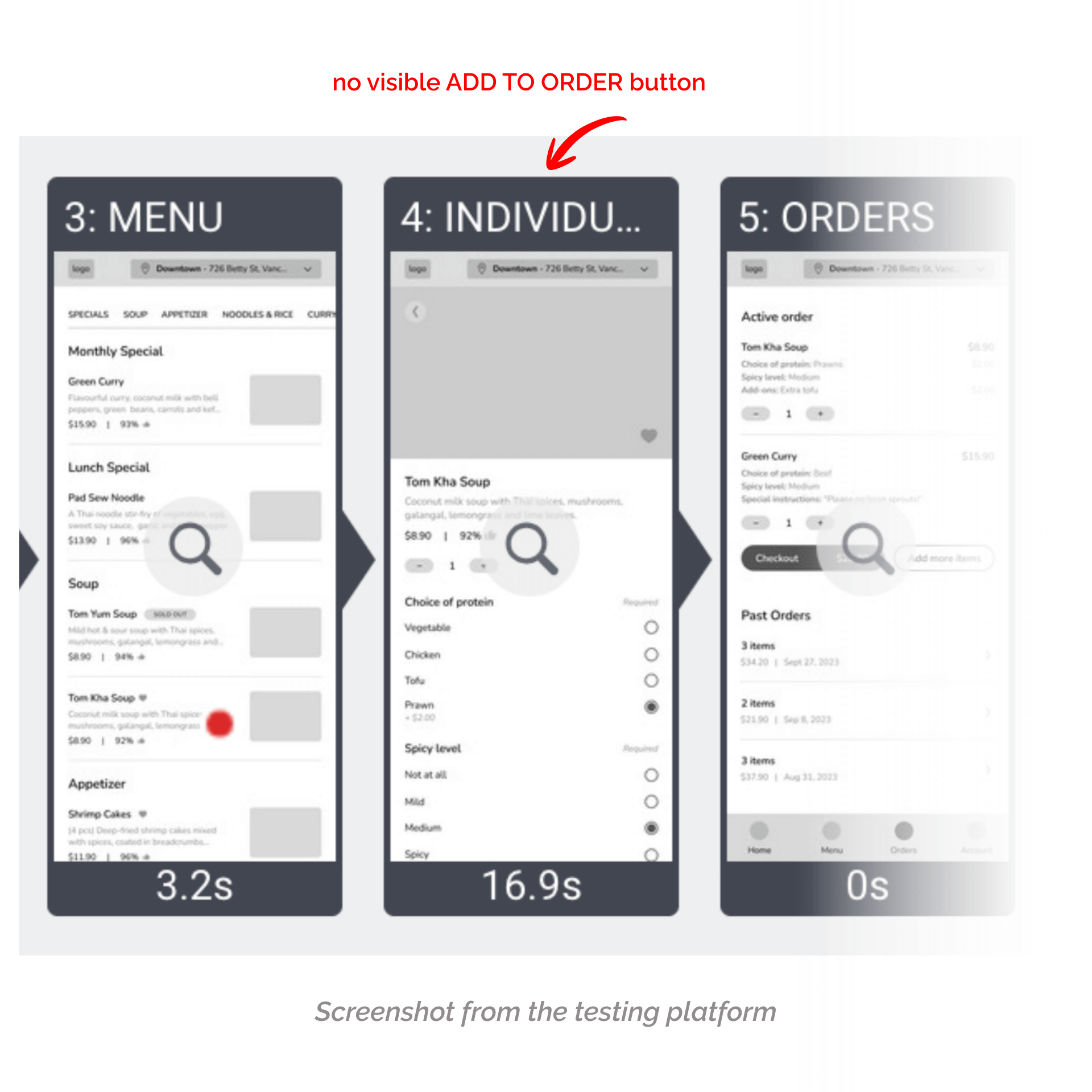
Finding #2
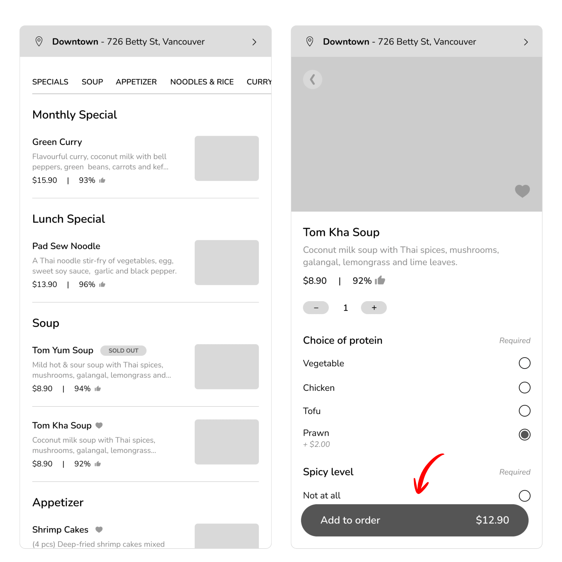
A few participants wanted the ‘Add to Order’ button to be more accessible, so they wouldn’t have to scroll all the way to the bottom while customizing their meal.
- 4 out of 8 participants who successfully added their meal to the cart mentioned that having to scroll all the way to the bottom to tap “Add to Order” felt inconvenient.
“Very clear and easy to spot the menu. The add to order button should be fixed on the screen instead of making the user scroll all the way to the bottom.” – Participants No.8
Implementation
I made the ‘Add to Order’ button persistent so it remains on screen throughout the customization process, eliminating the need to scroll to the bottom to complete the action. I also incorporated dynamic pricing into the button, allowing users to see the updated cost of their item as they add or remove extras.
BEFORE
AFTER
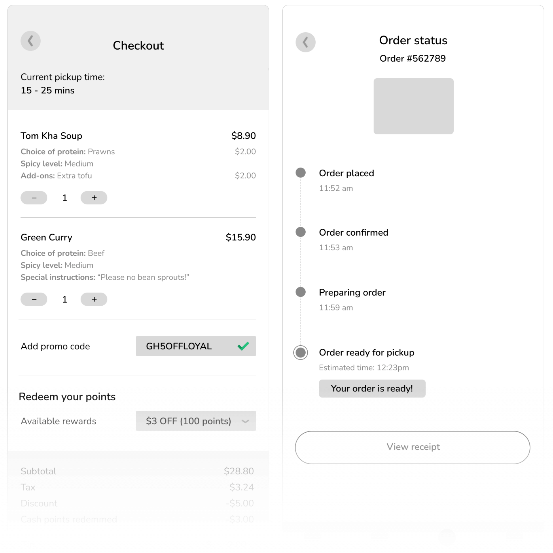
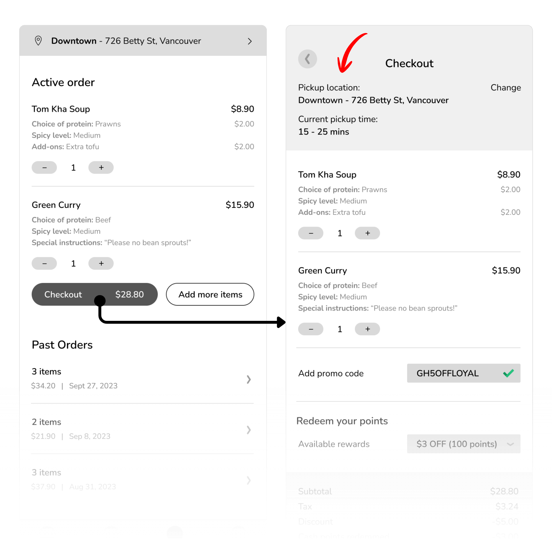
Finding #3
Some participants like to have their pickup location confirmed before placing the order
- 3 out of 8 participants successfully setup their pickup location but they were having difficulties finding the drop down and suggested that it’d be helpful to have the pickup location confirmed prior to checkout
- 1 out of 8 participants missed the location drop down entirely. This is a good chance/reminder for the user to select the pick up location
“Alls good, nothing out of the ordinary, simple and efficient. It’d be nice to show the pickup location in the tracking or in the checkout.” – Participants No.8
Implementation
I added the full pickup address at the top of the checkout page, along with a ‘Change’ button that lets users easily update their pickup location if it’s incorrect.
BEFORE
AFTER
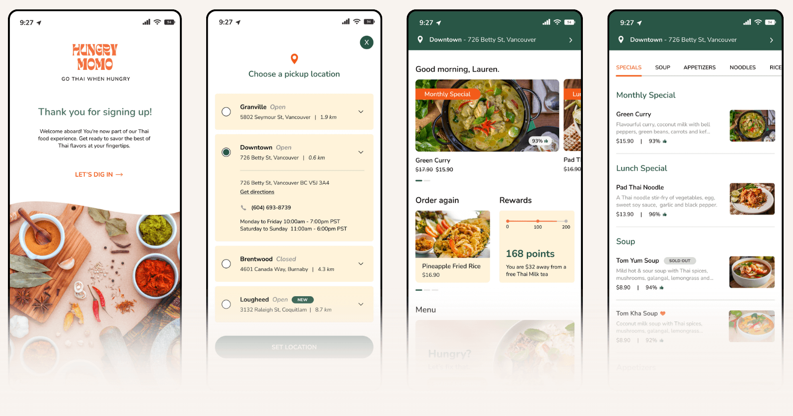
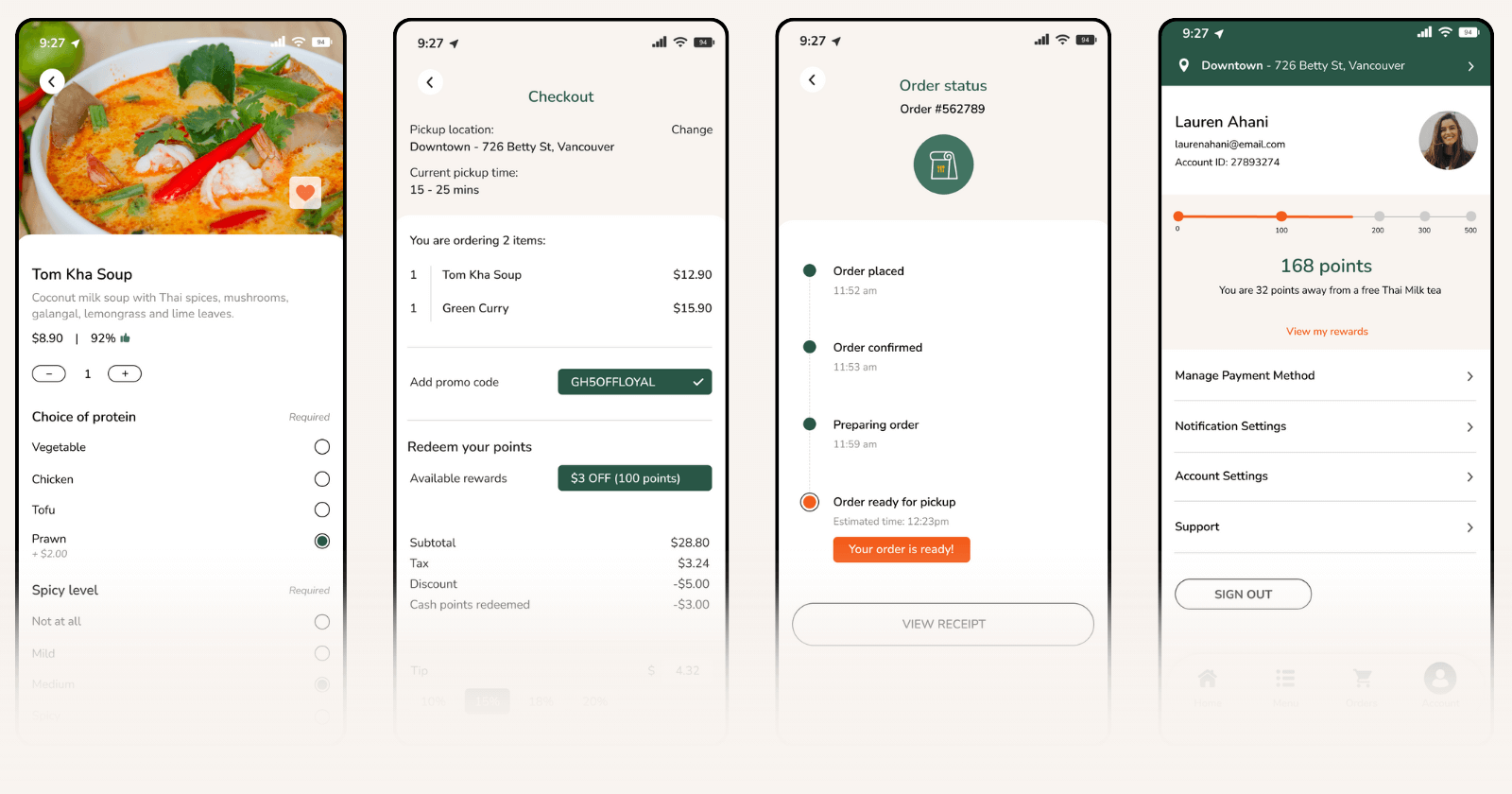
Prototype
Once the wireframes were tested, refined, and validated, I moved on to building the high-fidelity prototype using Hungry Momo’s visual identity — colors, typography, and imagery inspired by its vibrant Thai street-food style.
I updated each screen for clarity and usability, integrating the feedback from user testing and implementing solutions to address the key pain points. Finally, I added interactive elements and transitions to bring the experience to life and simulate the full end-to-end ordering flow.
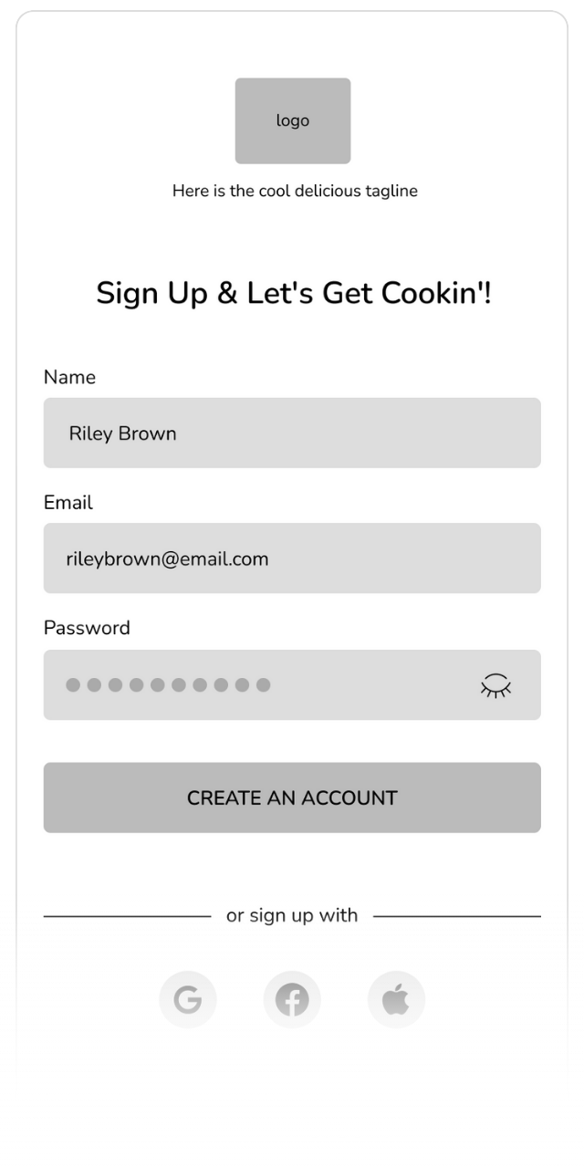
Create an ccount
Set up your profile in just a few taps so you’re ready to order anytime.
Choose your pickup location
Pick the nearest Hungry Momo truck so your order goes to the right spot.
Browse the menu & choose your meal
Explore the full menu and customize your favorite Thai dishes.
Place your order
Review your meal, check the details, and pay securely in seconds.
Pick up when it's ready
Track your order and head over only when it’s hot and ready.
Takeaways
WHAT THIS PROJECT TAUGHT ME
Hungry Momo needed a solution to long wait times and lost customers. The goal was to create an end-to-end ordering and payment app that gives users a faster, clearer, and more convenient food-truck experience.
Through the process of designing this app, these are the main things I learned:
1. Talking to real users changed my assumptions
Interviewing people with actual food-truck experience gave me insights I couldn’t get from secondary research alone. Hearing firsthand how differently people prioritize convenience, wait time, and ordering preferences helped me design with a more realistic perspective.
2. Building a product from scratch requires deeper research and planning
Unlike improving a feature in an existing app, this project required building everything (the concept, flow, structure, and requirements) from the ground up. This forced me to dig deeper into industry habits, customer behavior, and competitive gaps. It also taught me how important it is to validate ideas before designing anything.
3. My first round of wireframes performed better than expected
User testing showed that the initial structure and flow were quite strong, with only a few areas needing refinement. This reinforced the value of starting with thoughtful low-fidelity wireframes before jumping into high-fidelity visuals.
4. Presenting and organizing the process is a skill of its own
A big personal learning was how much effort goes into keeping everything (research notes, affinity diagrams, user flows, wireframes, and iterations) organized and consistent. It was more work than I expected, but having a clean and structured workflow made the entire project easier to navigate and present.
What's Next?
If I had more time to continue developing this project, here are a few next steps I would explore:
-
Add more interactive animations
To enhance the visual experience and make the app feel more dynamic and polished. -
Explore features for personalization
Such as favorite orders, saved pickup locations, and dietary preference presets to streamline repeat usage. -
Consider customer support options
A lightweight chat or contact feature could help resolve issues, though staffing and feasibility would need validation with actual food-truck operations. -
Conduct a second round of testing
Using the high-fidelity prototype to gather more detailed usability feedback and validate final refinements, as well as to confirm whether the refined UI and interactions successfully address earlier pain points.
The Final Serving
This project began with a simple problem: people don’t want to wait in long food-truck lines, and grew into a full end-to-end product design challenge. By talking to real users, testing early ideas, and refining the experience, I created a solution that feels intuitive, thoughtful, and genuinely helpful.
Working on Hungry Momo reminded me how important it is to stay curious, organized, and willing to adapt. Every step of the process pushed me to grow as a designer ♥