Overview
Unblocked Homepage Web Redesign
Design Exercise | 2026
This was a design exercise completed as part of Unblocked’s interview process for their Brand Designer role. The assignment was intentionally open-ended: redesign the homepage to clearly communicate what Unblocked does and who it’s for, while staying directionally familiar with the existing brand.
Unblocked is an AI-powered codebase assistant that helps development teams get instant answers about their code, reducing context switching and interruptions. The product targets engineering teams at startups and scale-ups who lose significant time searching for answers or waiting on teammates.
Role
Brand & Web Design
Timeline
72 hours
Deliverables
Research, wireframes, high-fidelity mockup
Tools
Figma
The Challenge
“Clearly communicate what Unblocked does and who it’s for, while staying directionally familiar with the existing brand.“
That was the extent of the brief, intentionally open-ended to test strategic thinking and creative problem-solving yet left significant room for interpretation. This balance between respect and evolution became a core challenge of the project.
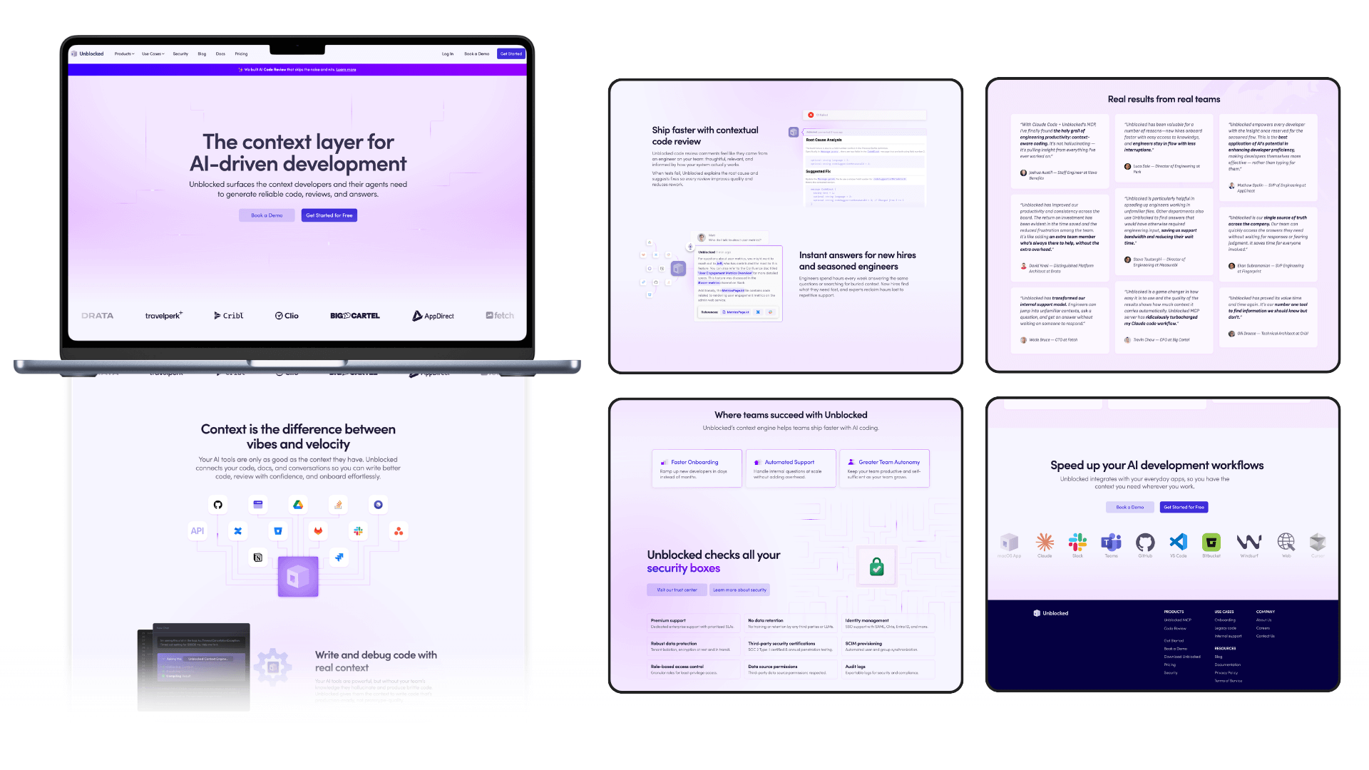
The Problem
The existing Unblocked homepage had strong foundations: clean aesthetic, established brand identity, clear messaging – but I identified opportunities to strengthen the experience:
- Product visibility: No prominent product screenshots showing what users actually get
- Problem articulation: Pain points weren’t clearly stated, making it harder for developers to see themselves in the story
- Benefits clarity: Features were mentioned but benefits could be more concrete and specific
- Social proof: Limited credibility signals and customer validation could be presented better
- Information hierarchy: Some elements competed for attention rather than guiding the eye through a clear narrative
Below is the current Unblocked Homepage.
View live site →
The Goal
The goal is to create a homepage that:
01.
Immediately answers: What is this? Who is it for? Why does it matter?
04.
Communicate specific benefits for individuals as well as teams, not just features
02.
Shows the product prominently so users understand what they’re getting
05.
Builds better credibility through better presented and more social proof
03.
Articulates the problem clearly so developers can relate
06.
Guides users through a clear story with strong hierachy
Research & Analysis
Competitive Analysis
To understand what works in this space, I analyzed leading developer tools including Cursor, Codeium, Linear, Claude Code and GitHub Copilot.
Key Patterns
- Dark hero sections align with developer preferences and create better contrast for CTAs
- Product demos are prominent – developers need to see what they’re getting
- Clear, jargon-free messaging that answers “what is this?” immediately
- Social proof (stats, logos, testimonials) in dedicated sections shortly after hero section
INSIGHT: Developer audiences value clarity, technical credibility, and seeing the actual product. The most effective sites balance approachability with a premium feel through dark themes and straightforward communication.
Target Audience Assumptions
Given the open-ended brief, I made strategic assumptions: engineering teams at startups and scale-ups (5-50 developers) dealing with context switching and knowledge silos, plus senior developers spending significant time answering teammates’ questions.
The core pain point: developers lose roughly 40% of their time searching for answers instead of building.
In a real project, these would be validated through user interviews, customer data analysis, and actual analytics rather than assumptions alone.
Wireframe
Explorations
I focused my wireframes on the hero section—the hook that determines
whether someone keeps scrolling. The hero needed to answer three questions
immediately: What is this? Who is it for? Why does it matter?
I also knew social proof would be crucial, but placement matters for
hierarchy.
I explored three approaches:
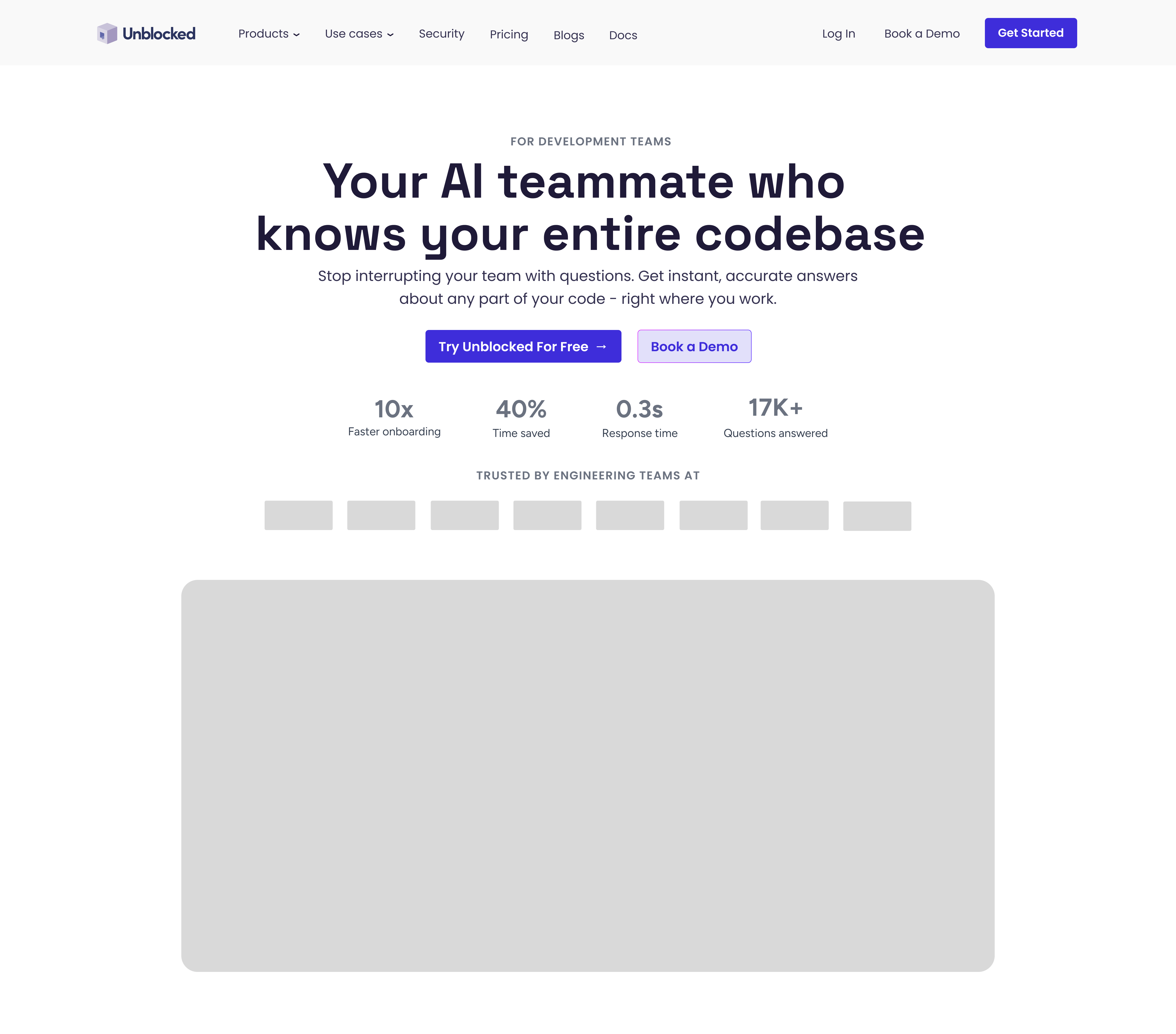
Option A: Centered with Integrated Stats
Compact but cluttered – too much competing for attention.
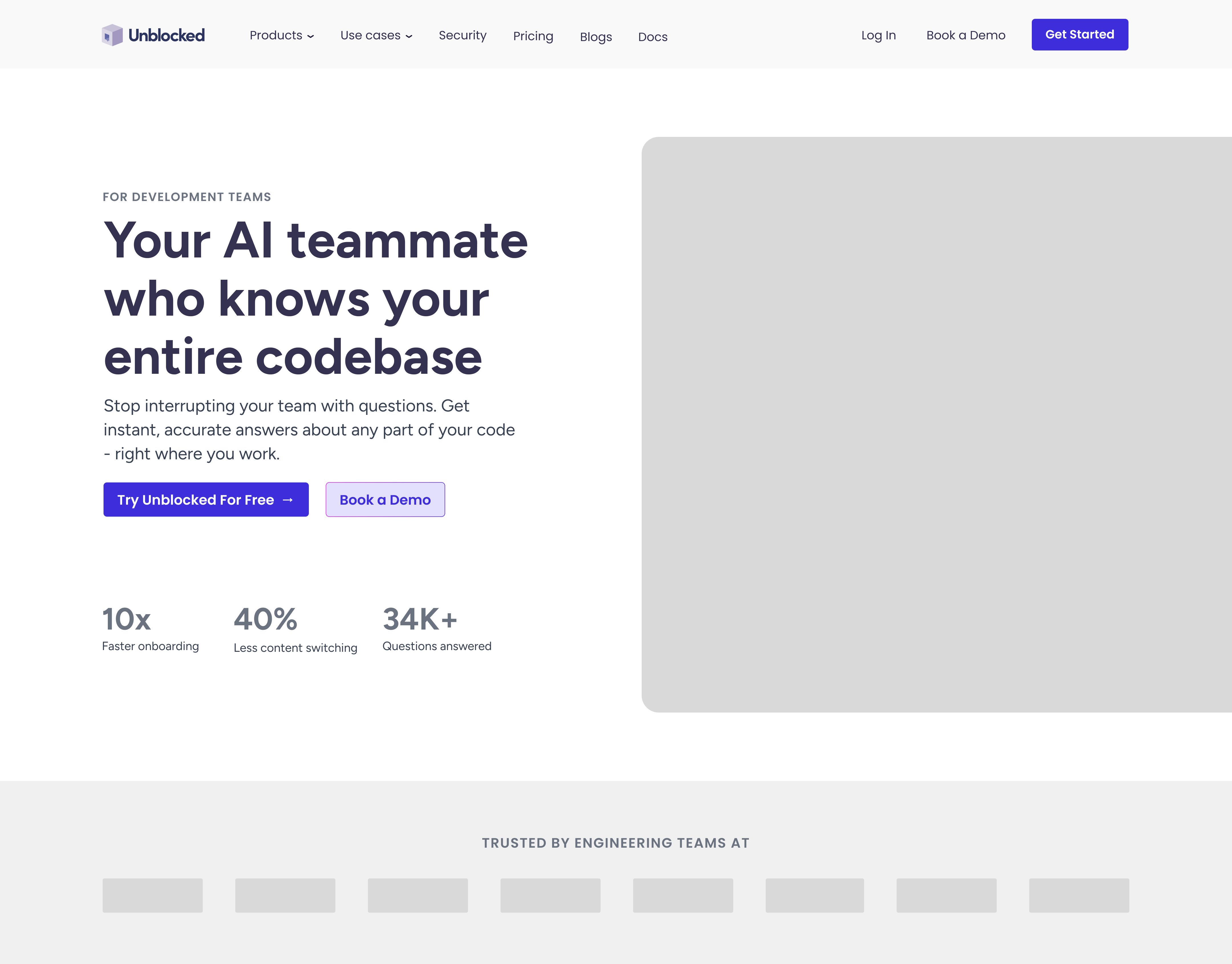
Option B: Side-by-Side Layout
More dynamic with visible product, but less message-focused.
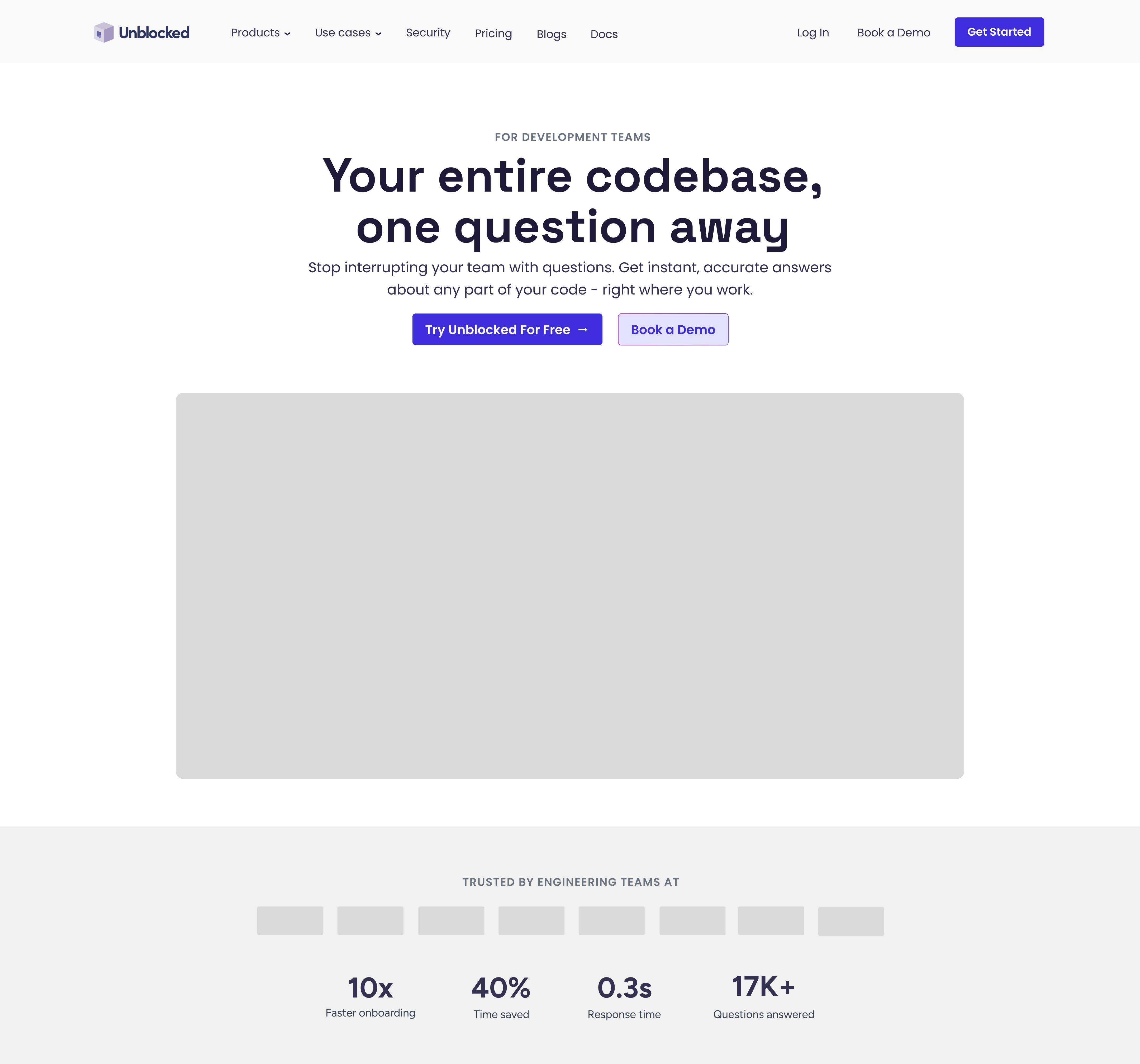
Option C: Centered with Separated Social Proof
✓ SELECTED
Clean focus in hero, dedicated social proof section below. This structure answers the three questions clearly, then validates credibility through separated stats and logos.
FULL PAGE WIREFRAME
With the hero decided, I mapped the complete page to ensure the narrative flow worked before moving to visual design.
The page follows this structure:
Hero → Social Proof → Problem → Before/After → Solution → Proof → Trust → Conversion
This flow leads with value, establishes credibility, creates urgency, demonstrates transformation, and closes with conversion.
In a real project, I’d validate this through scroll depth analysis and test different section orders to optimize engagement.
Reflection
What I Learned
Working within an existing brand system while evolving it taught me to balance respect for established work with bringing fresh perspective. Starting with wireframes prevented getting attached to visual decisions too early: structure first, polish second.
Researching developer tool sites reinforced how critical audience-specific choices are. Dark themes, clear messaging, and visible product demos aren’t just aesthetic preferences – they’re expectations for this audience.
What I'd Do Next
With more time and collaboration, I would:
- Validate assumptions through user interviews and customer data analysis
- Create responsive layouts for mobile and tablet
- A/B test hero messaging variations to measure conversion impact
- Develop a complete component library with detailed specs
- Analyze performance data to prioritize improvements
Limitations
This exercise was based on public information, competitive analysis, and industry best practices.
A real project would include access to analytics, stakeholder input, iterative testing, and cross-functional collaboration to validate decisions with actual user behavior and business data.