ETHONY TAROT
Meet Ethony: a multifaceted professional, renowned as a Tarot reader, author, teacher, and modern witch. Her business offers a diverse array of online courses covering Tarot and Witchcraft, alongside her own line of Tarot decks. With a substantial following across various social media platforms, Ethony also excels as a content creator, producing engaging videos for YouTube, captivating posts and reels for Instagram and TikTok, and fostering a vibrant Tarot community on Facebook with tens of thousands of members.
When I joined her team, Ethony and her partner expressed a keen interest in redesigning both their main websites to give it a more modern, refined, and sophisticated aesthetic. Unfortunately, this website never came to life as I moved on to another opportunity before the development process starts.
View current website.
PROJECT
Work project – Website redesign
DELIVERABLES
- Wireframe
- Mockup
- Prototyping
The Pain Points
In addition to the outdated design, there are critical pain points affecting the website’s information flow and user experiences:
- Lack of brand identity. The website lacks a cohesive brand identity, with inconsistent use of colors, typography, and imagery hindering navigation and the overall flow of information for visitors.
- Non-responsive design is a significant concern, particularly with 73% of internet users browsing on mobile devices, representing a substantial missed opportunity for generating leads and sales.
- Weak messaging fails to effectively convey the business’s value proposition, impeding trust-building and conversion. Clear messaging is pivotal in guiding user experience and ultimately converting visitors into customers.
- The absence of clear call-to-action buttons is a notable issue, as they play a vital role in directing visitors to take the next step. Ensuring these buttons are prominent and clearly defined is essential for enhancing user engagement and facilitating conversion pathways.
01. Research
With time constraints looming over the project, I entrusted my project manager to take the lead. After she conducted thorough market and competitive research, she presented me with a detailed brief outlining the visual directions and information structure desired for the website, along with multiple references.
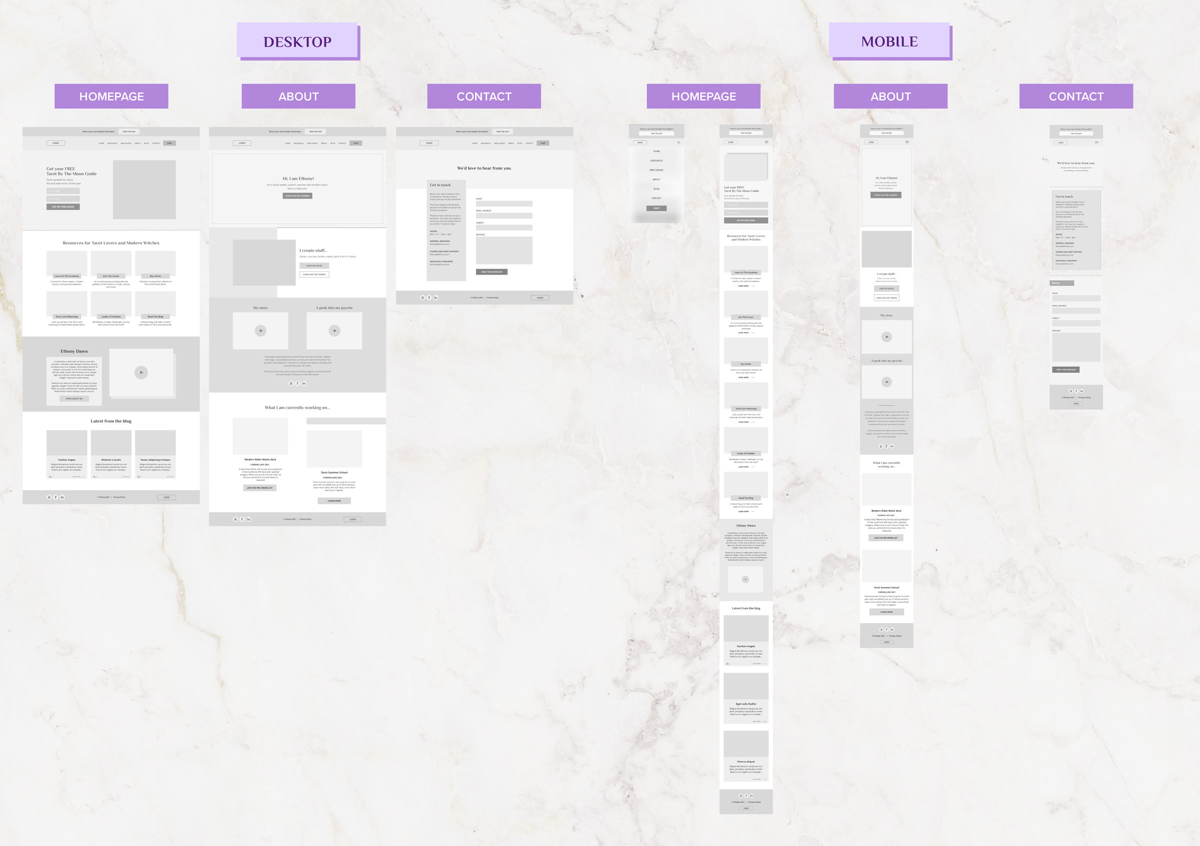
02. Wireframe
We kicked things off by focusing on the three most visited pages: the home, about, and contact pages. Once I grasped the project’s objectives, I delved into crafting wireframes, beginning with rough sketches on paper before transitioning to low-fidelity wireframes using Adobe XD.
These wireframes serve as the skeletal framework of the website, allowing us to quickly identify and address usability issues early in the design process.
Recognizing the importance of a robust wireframe, we aimed to achieve several improvements based on the above identified pain points:
- Strengthening branding consistency: We focused on ensuring a cohesive brand identity throughout the website, with consistent use of colors, typography, and imagery to enhance brand recognition and user experience.
- Mobile responsiveness: Our goal was to ensure seamless functionality across both desktop and mobile devices, optimizing the user experience regardless of the device used to access the website.
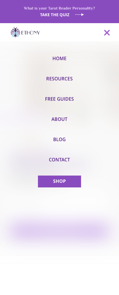
- Revamping navigation flow: We restructured the top navigation to create a more intuitive and straightforward user journey, minimizing confusion by streamlining the navigation process and reducing the number of sub-pages.
- Implementing clear CTAs: To guide visitors effectively, we incorporated additional and clearer calls-to-action (CTAs) strategically placed throughout the website, directing users towards the desired actions and improving overall engagement and conversion rates.
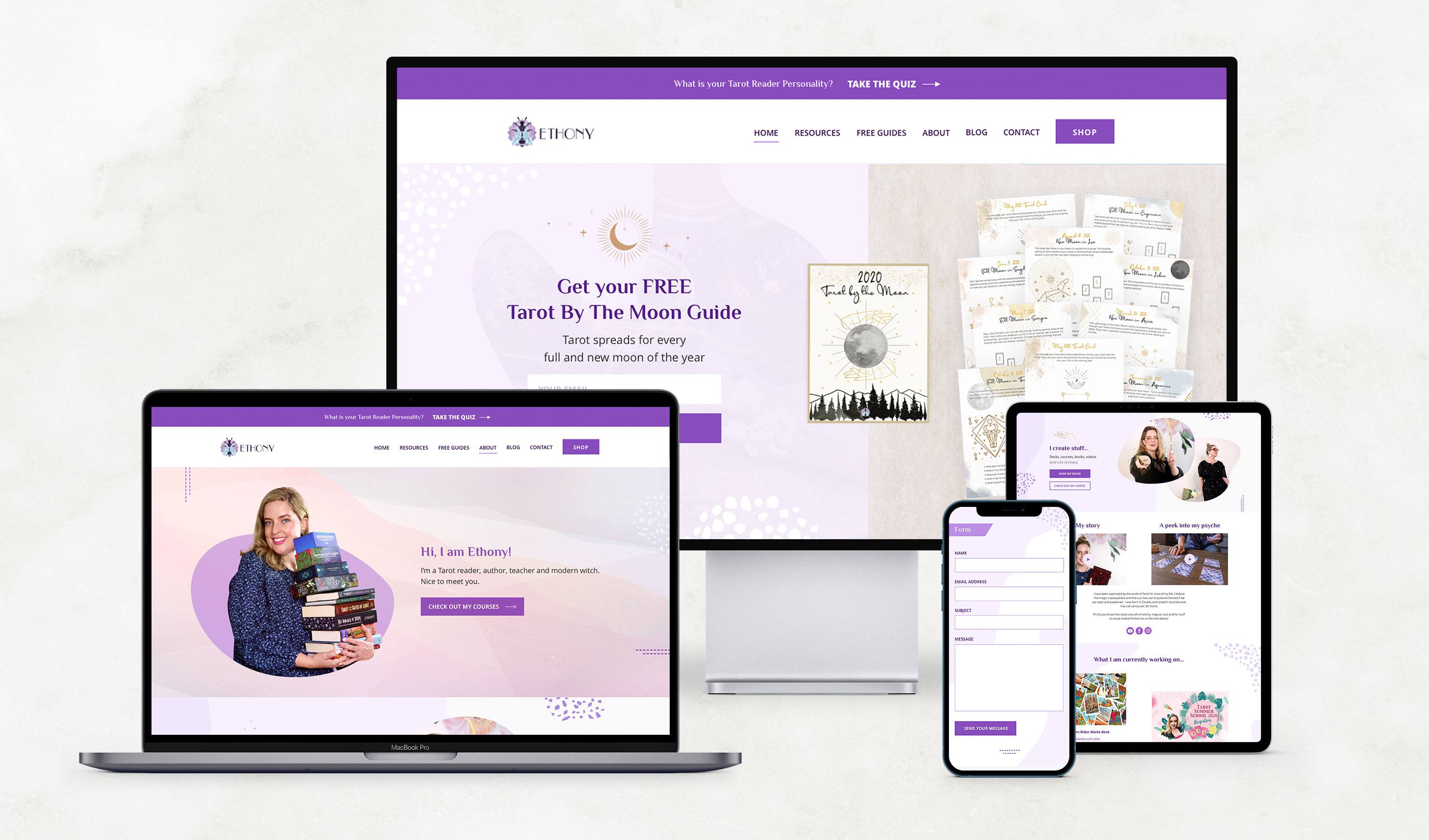
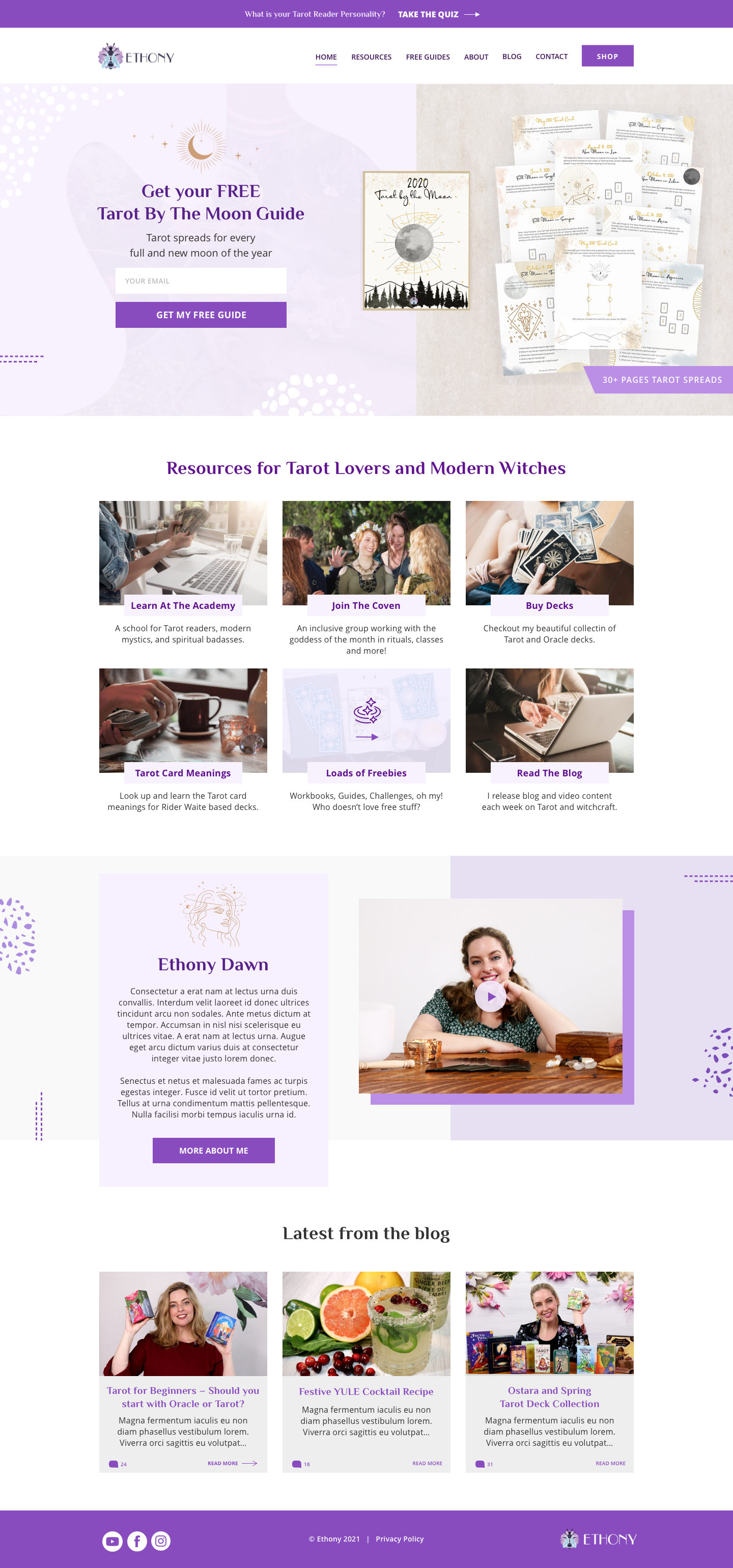
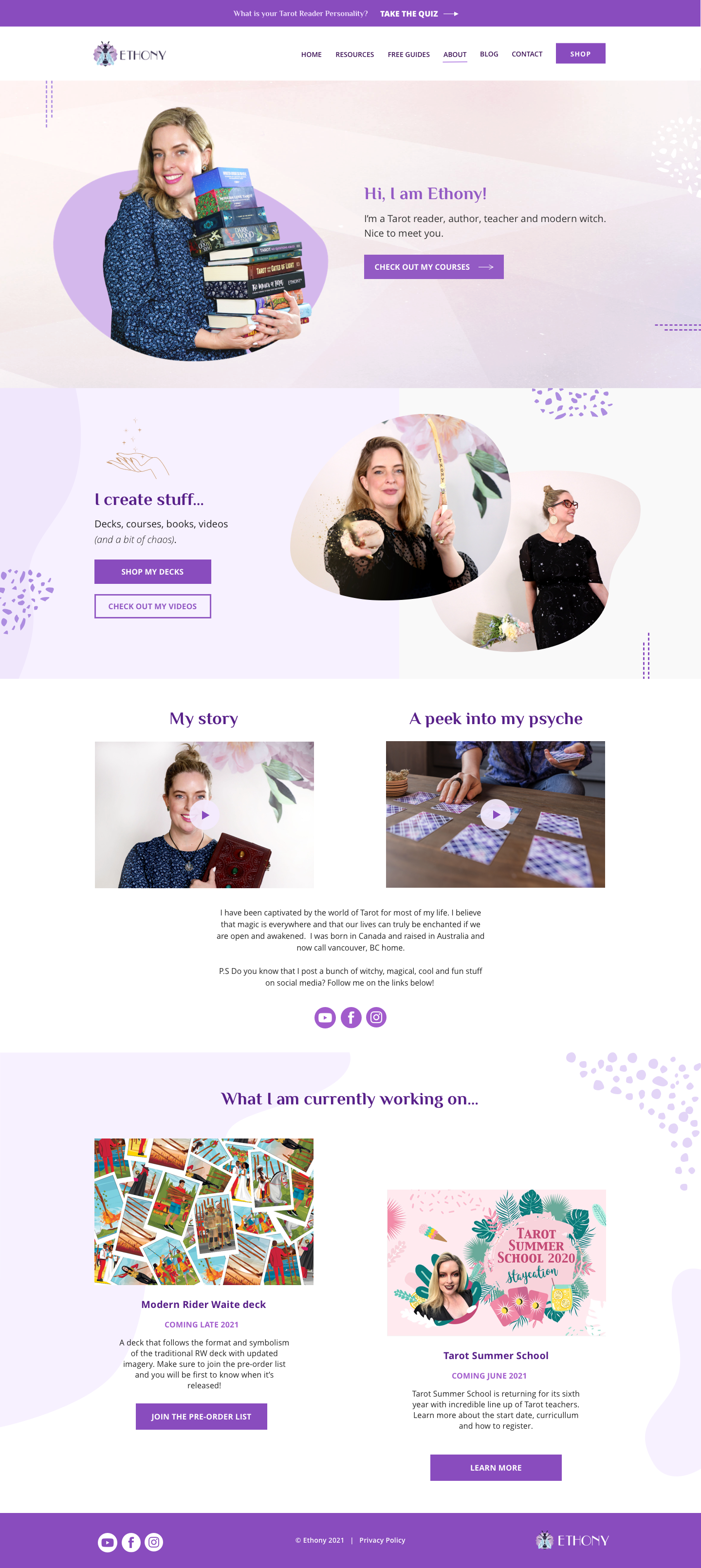
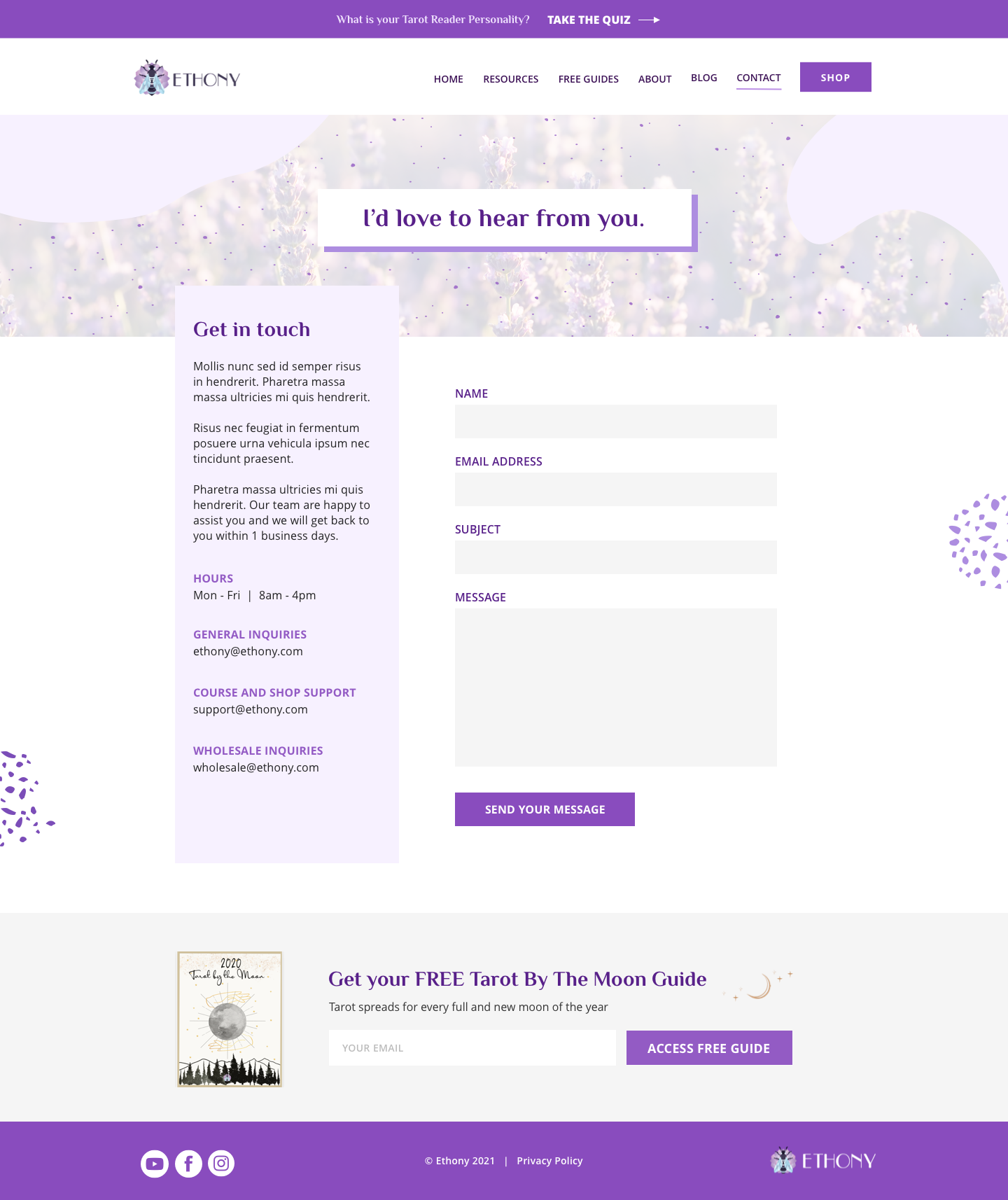
THE MOCKUP
Strengthening Brand Identity:
With purple as the company’s signature color, I maintained its presence while introducing lighter shades to add brightness. Inspired by Ethony’s magical brand persona, I incorporated accents of yellow-gold, evoking a sense of enchantment. Abstract shapes in the background were included to infuse the design with cheerful and uplifting vibes.
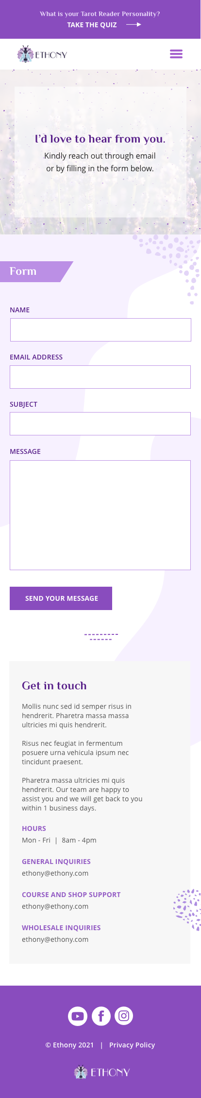
Mobile Responsiveness:
Though not fully demonstrated in the mockup, I ensured the design’s adaptability for mobile devices, prioritizing smooth navigation and content flow.
Navigation Flow and Clearer CTAs:
To drive traffic to the online store, I emphasized a prominent “SHOP” button, creating a clear focal point. Streamlining the navigation bar by removing non-essential links enhances user experience. For converting visitors into course buyers, I strategically placed course information right after the hero section on the homepage, maximizing visibility.
HOMEPAGE
ABOUT PAGE
CONTACT PAGE
HOMEPAGE

ABOUT PAGE

CONTACT PAGE
NAV BAR