Overview
Breadstack Marketing Web Design System
Breadstack is a Vancouver-based SaaS company that provides an all-in-one e-commerce and customer experience platform for cannabis retailers. The product helps dispensaries manage online ordering, delivery, marketing, and customer support from a single system.
As part of a marketing website refresh, I created a lightweight design system to keep the experience consistent as new pages and features were added. The goal was to establish a flexible foundation that could scale with the product and support faster landing page production.
Role
Designer (Marketing)
Scope
Marketing website refresh, landing pages, and lightweight design system
Outputs
Foundations (type, colour, spacing) + components (buttons, cards)
Tools
Figma
The Challenge
The brand had recently been refreshed, and the marketing site was evolving quickly. New landing pages and feature sections were being created on tight timelines, but there was no clear component system in place.
The challenge was to create a lightweight, flexible design system that could support rapid page creation while keeping the experience visually consistent, even as the brand continued to evolve.
My Approach
I focused on building a practical, lightweight system that the team could use immediately. The approach was:
1. Establish clear foundations
Define a consistent typography, scale, and colour structure based on the refreshed brand.
2. Create core reusable components
Design flexible elements like buttons and layout sections that could be reused across multiple landing pages.
3. Keep the system adaptable
Build a system simple enough to evolve alongside the brand and product without slowing down the team.
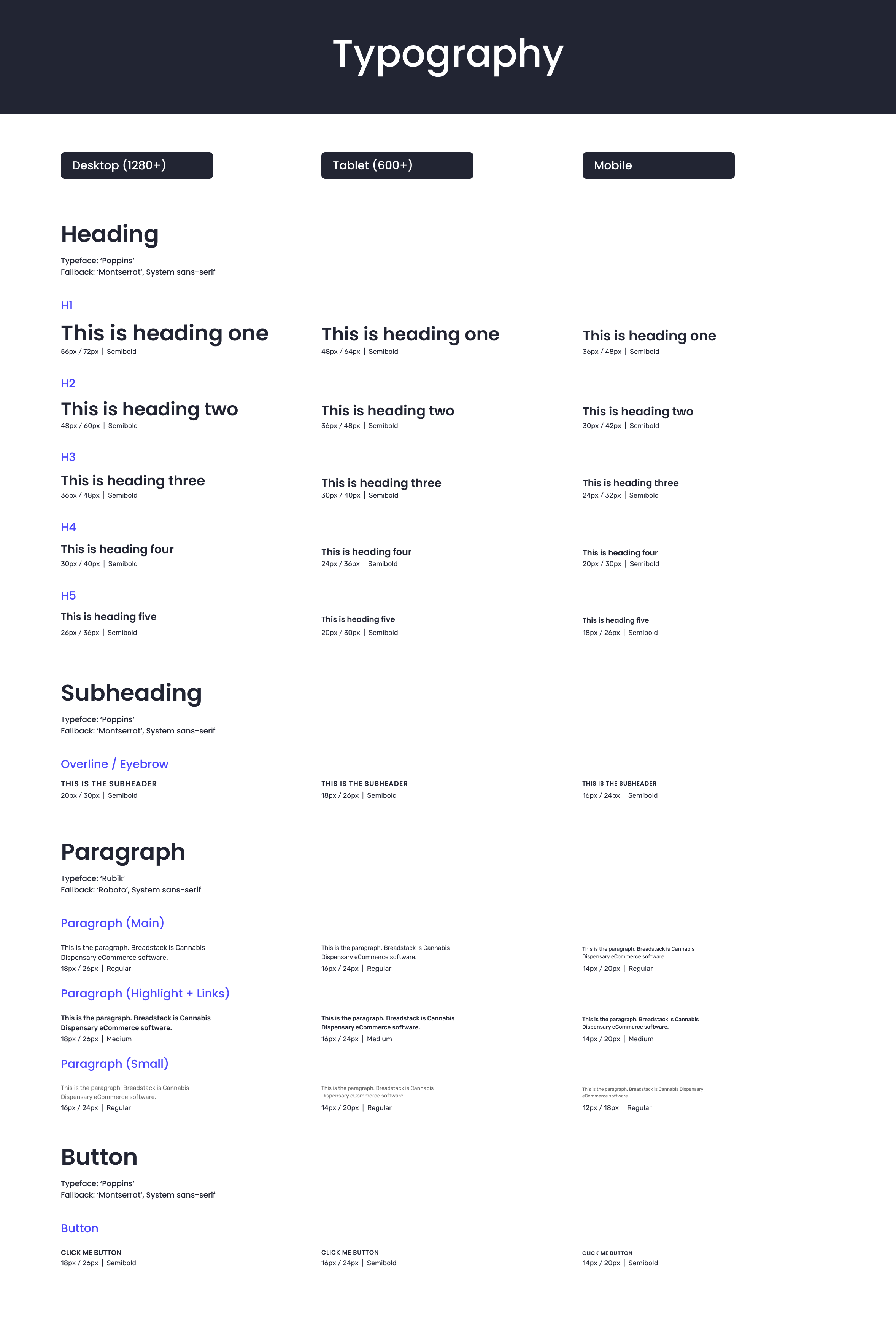
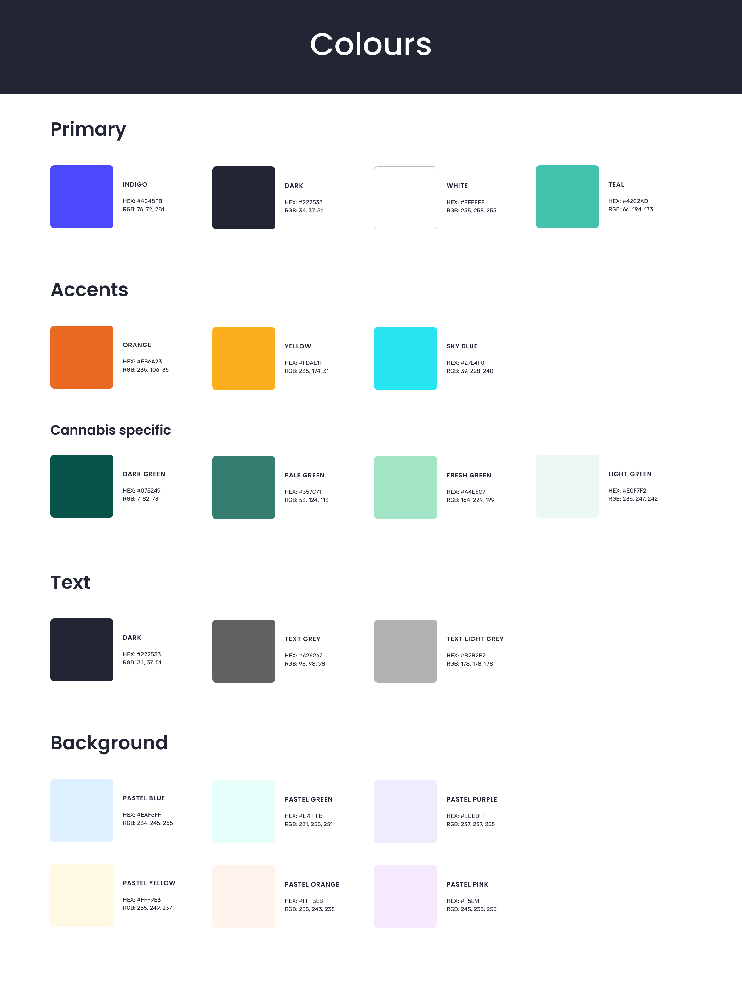
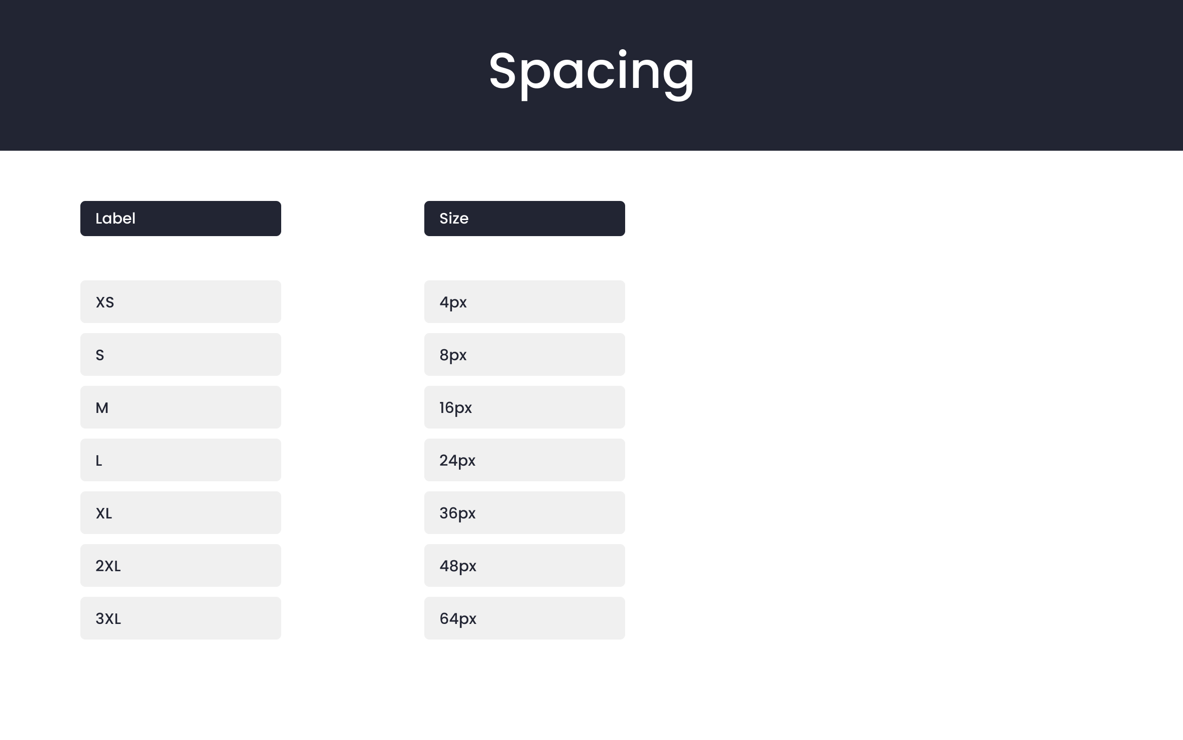
System Foundations
Typography, colour and spacing formed the foundation of the system, creating a clear visual hierarchy and ensuring consistency across all pages.
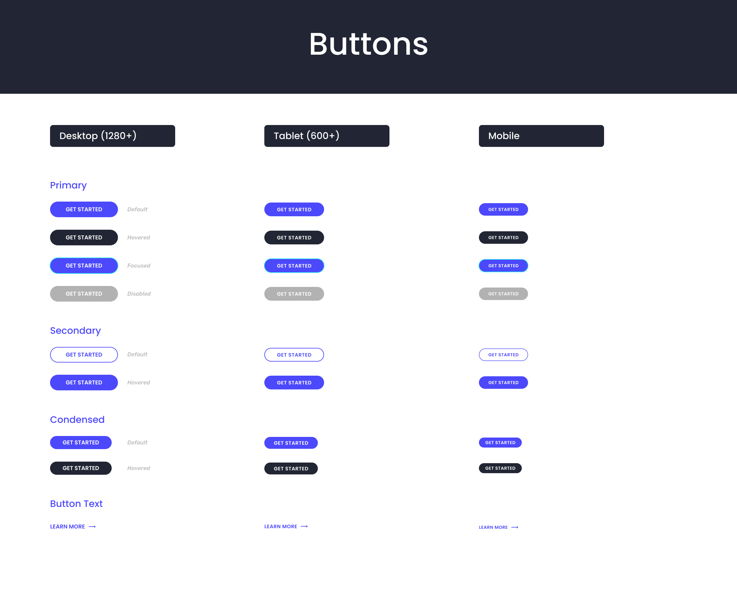
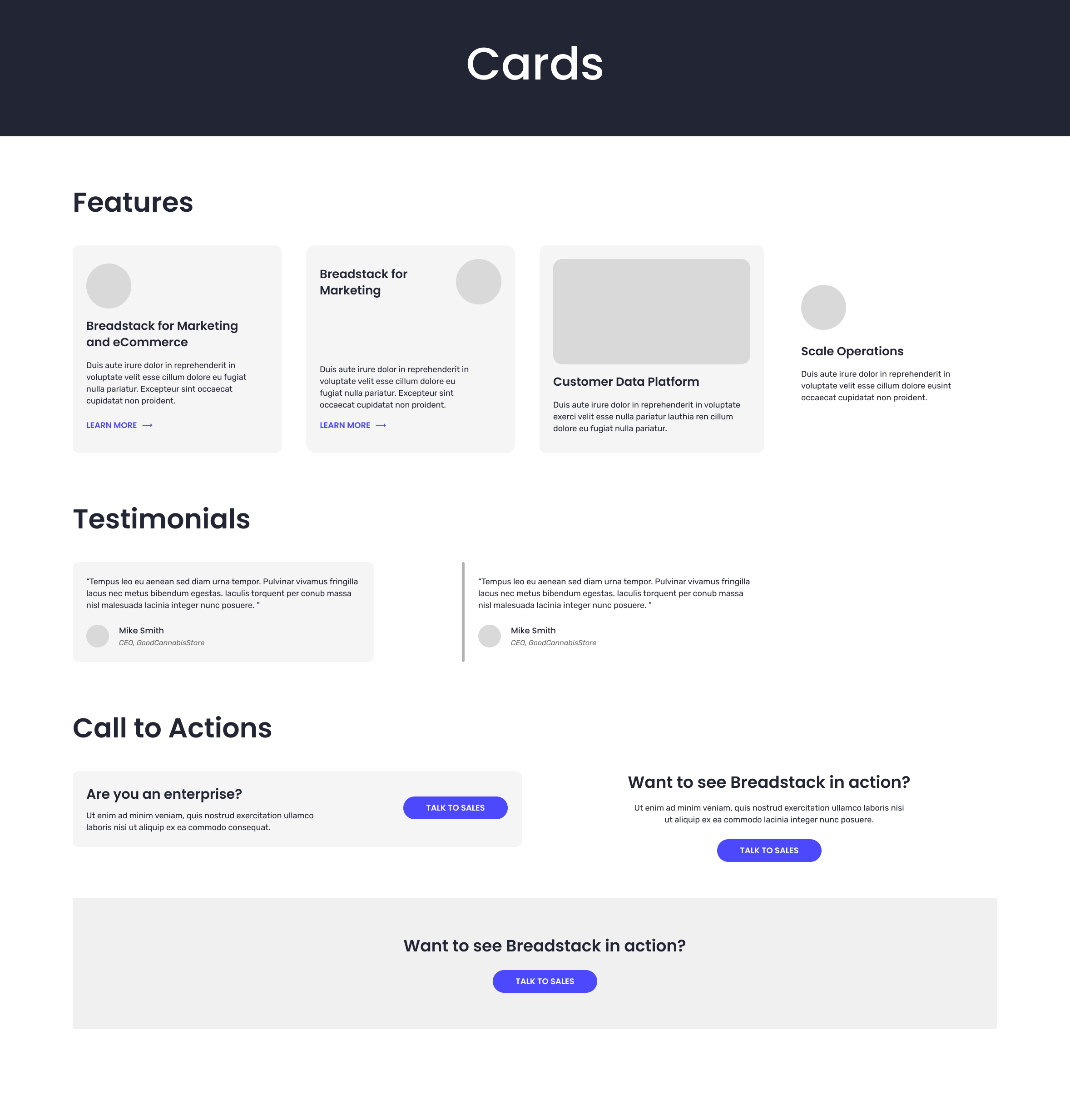
Core Components
Reusable components such as buttons and cards were created to support common marketing patterns like feature highlights, testimonials, and calls to action.
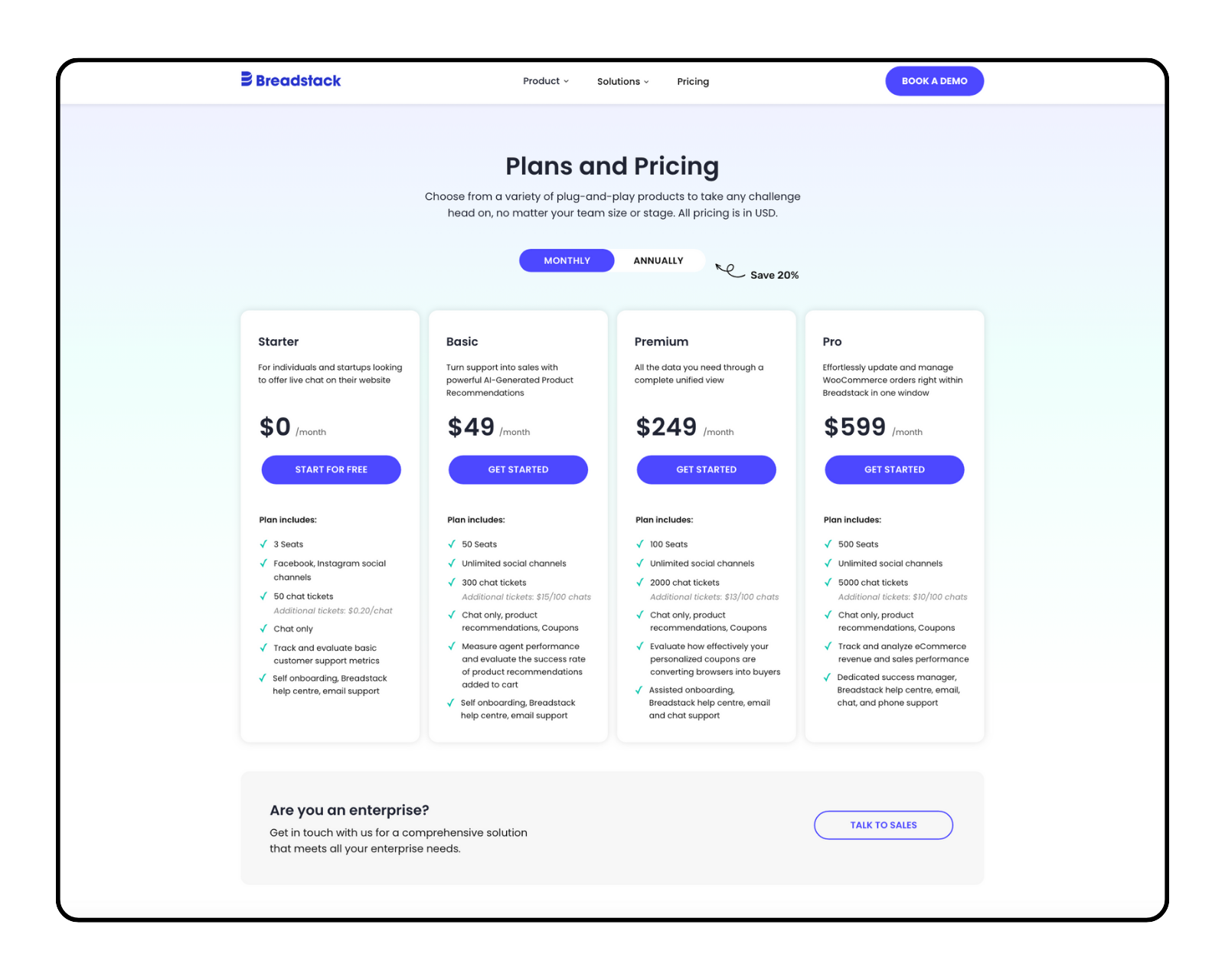
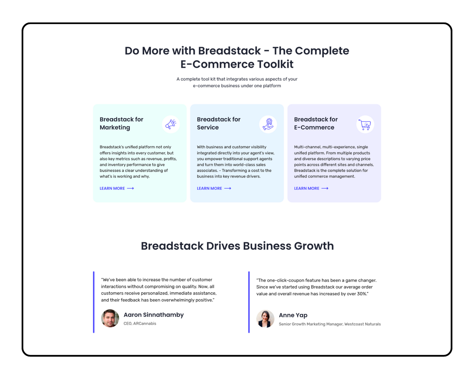
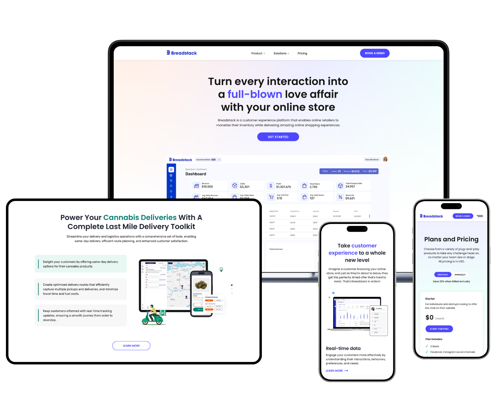
System in use
These sections were built using the same typography, color, and component patterns, allowing the team to create new marketing pages quickly while maintaining a consistent experience.
Pricing page using card + button components
Feature section using reusable card modules
Responsive layout across devices
Outcome
The system created a shared foundation of styles and components, making it easier to build new landing pages while maintaining consistency across the site.
It also helped align design and development around reusable patterns, reducing one-off solutions and supporting faster iterations as the brand evolved.